Chart of the Day
Josh Harkinson says the big new climate report released today by the Obama administration is no big deal because it's largely the same as the draft report that was released by the Bush administration last year. Technically, maybe that's true. But even though the report won't directly affect either legislation or agency rulemaking, surely it matters that we have an administration that actively and willingly releases a comprehensive report like this rather than one that fumes and delays and denies for four years before finally being forced to make it public with about the same enthusiasm that most of us reserve for getting a root canal?
Besides, even though it's primarily a review of existing literature, it's a pretty good review, covering everything from wildfires to rainfall to hurricanes to the fact that Illinois will look like Texas by 2100 (that's on p. 117). Having a report this good, this comprehensive, and this authoritative may not save the planet, but it's still a pretty worthwhile data source to have around.
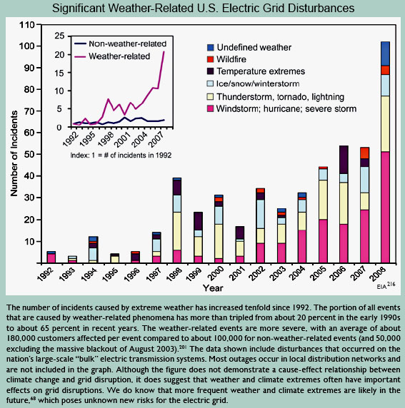
What's more, it's a gold mine of colorful charts! And you know I'm a sucker for that kind of stuff. So here's your chart of the day: a 15-year history of electrical grid problems caused by increasingly extreme weather. That's a new one on me, so maybe it's a new for you too. The full report is here.
UPDATE: I picked this chart sort of randomly just because I'd never seen anything like it before. Turns out there was a good reason for this: the increase in electrical grid problems is mostly the result of better reporting, not climate change. Sorry about that. Details here from Warren Meyer.
UPDATE 2: Evan Mills, who created this chart, emails to respond to Meyer's criticism. He points out that (1) the caption specifically says this data doesn't demonstrate a cause-and-effect relationship, (2) the growth in weather-related incidents is not merely an artifact of better data collection, and (3) there was a larger increase in warm weather incidents than cold weather incidents. However, regardless of whether climate change has caused any of the recent increase in grid disturbances, the data does show what may be in store for us in the future if climate change continues. More here.

Advertisement
Advertisement
Comments
Chart
The causal relationship between climate change and electrical grid problems is plausible. However, note that this over-time chart is also consistent with the effect of an aging electrical grid. As the grid gets older and if significant repairs/upgrades are delayed due to, oh I don't know, the reluctance of GOP politicians to invest in infrastructure, then we would expect a chart like this even absent climate change impacts. Just sayin ...
I don't think it says what
I don't think it says what they think it does, but it does imply we need to invest in that grid. The struggle is to spend the money where it is needed and not by congressional district.
Space weather is also an
Space weather is also an issue. A big fast mass ejection that hit earth could cause collapse-of-civilization grade problems, e.g. something of the size of the 1859 storm. (See also the wikipedia article). A smaller storm in 1989 knocked out the grid in Quebec for a while. I've read that a larger event would quickly overwhelm the available stockpile of spare parts and crews trained to install them.
Early warning is key - measures can quickly taken to harden the grid.
Improvements to the resiliency of the grid are important for lots of reasons.
Re space weather, a National
Re space weather, a National Academies Press report "Severe Space Weather Events--Understanding Societal and Economic Impacts:
A Workshop Report", is very interesting reading. (Scroll down for the free html formatted version of the report.)
Re space weather
You know what? It's all okay, because we're not going to do anything about *that*, either.
Man-made climate change? Weather from space? Madness, I tell you, madness!
linemen organized in a sort of National Infrastructure Guard
Every year some huge swath of the country has its electricity knocked out by ice storms or hurricanes or some other disaster and it takes weeks, or even months, to get it back up again.
Wouldn't it be practical to have a federal corps of emergency utility workers who could be deployed into these areas?
Regular linemen organized in a sort of National Infrastructure Guard.
Looks fishy
As a person who has lived through the entire period covered by the chart, I can't say that I have noticed an increase in extreme weather that would cause a ten-fold increase in grid problems. Was extreme weather really twice as bad in 2008 as 2007? Were there really no electrical problems in 1992 caused by thunderstorms? The chart doesn't pass a smell test.
Kevin, you are aware that
Kevin, you are aware that the US temperature anomaly trends slightly downward during precisely the period the chart claims ushered in a huge increase in weather-related grid outages, aren't you?
As stated, this chart doesn't even begin to pass the smell test.
Yes, you have your chart,
Yes, you have your chart, but it was cold in New York yesterday, and I bet it snowed unexpectedly somewhere in the last year. How's yer global warmin' explain that, Dr. Genius?
Not what you think
There has been no significant increase in extreme weather over the period of that chart; certainly not a ten-fold increase. Therefore, the increases in extreme-weather incidents, both the number and the severity, indicate an aging grid and a grid operating much closer to maximum capacity.
Since the changes forced on electric companies by environmentalists require or encourage them to invest in more expensive, capital-intensive generating systems that produce intermittent power, we can expect the CO2-policy-forced changes to increase, rather than decrease, the sorts of incidents appearing on that chart.
If the chart is meant to show the impact of global climate change and encourage rapid changes, it's a lie. The correct response is the opposite: we need to stick to traditional, easy electrical generating sources and update and expand the grid if we are to see a decrease in the incidents reflected on that chart.
Ice storms of early 2009
Too bad the chart doesn't include early 2009.
The folks in Tennessee still remember sitting in the dark for weeks after a severe ice storm took out power during the early days of the Obama Administration, while the new POTUS was too busy to notice them and make it a national priority.
This Chart Is Deeply Flawed
I am glad you found the electrical grid disturbance chart (your "chart of the day" on June 16) as particularly reflective of the quality of work on the recently released climate report . I agree, though perhaps for a different reason.
I find that you are typically good a smelling out BS on polls and studies -- even those, to your credit, where you agree with the findings. But you really missed it on this one. I immediately asked myself whether it made sense that weather-related outages had really increased 20-fold in 15 years. I questioned the chart in my blog, writing in part:
This chart screams one thing at me: Basis change. Somehow, the basis for the data is changing in the period. Either reporting has been increased, or definitions have changed, or there is something about the grid that makes it more sensitive to weather, or whatever (this is a problem in tornado charts, as improving detection technologies seem to create an upward incidence trend in smaller tornadoes where one probably does not exist). But there is NO WAY the weather is changing this fast, and readers should treat this whole report as a pile of garbage if it is written by people who uncritically accept this chart.
I did some actual checking, and called the gentleman at the EIA who owns and puts together the data set on which this is based. I reported what I found here, but in short he said:
He said that there may be an underlying upward trend out there (particularly in thunderstorms) but that most of the increase in this chart is from improvements in data gathering. In 1997, the EIA (and Makins himself) took over the compilation of this data, which had previously been haphazard, and made a big push to get all utilities to report as required. They made a second change and push for reporting in 2001, and again in 2007/2008. He told me that most of this slope is due to better reporting, and not necessarily any underlying trend. In fact, he said there still is some under-reporting by smaller utilities he wants to improve so that the graph will likely go higher in the future.
Further, it is important to understand the nature of this data. The vast majority of weather disturbances are not reported to the EIA. If the disturbance or outage remains local with no impact on any of the national grids, then it does not need to be reported. Because of this definitional issue, reported incidents can also change over time due to the nature of the national grid. For example, as usage of the national grid changes or gets closer to capacity, local disturbances might cascade to national issues where they would not have done so 20 years ago. Or vice versa - better grid management technologies might keep problems local that would have cascaded regionally or nationally before. Either of these would drive trends in this data that have no relation to underlying weather patterns.
Interestingly, apparently none of those "peer-reviewed settled science" guys who used the data even bothered to call him and make sure they understood what they were using, and no one in the editing and review process of this report looked at the chart and asked himself the most basic question -- does this really make sense? Do I really believe this?
Warren Meyer
www.Coyoteblog.com
OK, so now that we know that
OK, so now that we know that the chart is basically bullshit (at least as it relates to climate change), should that affect our view of the entire report?
By the way, Kudos to Kevin
By the way, Kudos to Kevin for admitting his mistake. It's a rare quality in pundits, unfortunately. Kevin's intelligence, good nature, and open mindedness is what keeps me coming back.
Post new comment
MoJo Comments: Send Us Your Feedback
We changed our spam software to better filter comments. Should you encounter any issues, please let us know.


