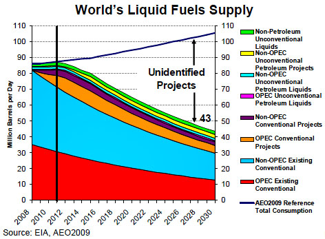
This chart comes from Glen Sweetnam of the Department of Energy (he’s the director of the EIA’s International, Economic and Greenhouse Gas division). The black line represents the year 2011. After that, oil production diverges sharply from projected demand, and no one knows how we’re going to make up the difference.
Sweetnam, by the way, is not talking about peak oil here. DOE subscribes to an “undulating plateau” theory, where oil production peaks and then stays more or less flat for a decade or so. Rather, Sweetnam attributes the production decline to a lack of investment. However, since new projects take years to come on line after they’re funded, this is a fairly thin distinction in the medium run. If investment is lacking today, then Sweetnam’s chart is probably accurate for at least the next few years.
What can be done? The possibilities are: (a) much higher oil prices to suppress demand, (b) a continuing recession to suppress demand, (c) amped up conservation and efficiency measures to suppress demand, (d) an increase in renewable sources of electricity along with an electrification of our transportation infrastructure, (e) biofuels, or (f) a switch to natural gas in place of oil — though I think the natural gas bonanza has been oversold, and in any case even if things go well it will take years for natural gas to seriously eat into oil consumption. I’m probably missing a few things, but this is basically the shape of the river. And all of them come with significant problems that I probably don’t have to go into.
Just thought I’d share. (Via ClimateProgress.)


