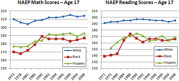
After reading Bob Somerby’s post about test scores yesterday, I decided to create a handy chart showing how our school kids have been doing over the past few decades. When I was done, though, I realized I didn’t really have anything urgent to say about the subject, so I didn’t write a post. But there’s no sense letting a good chart go to waste, so here it is:

These charts show scores on the NAEP math and reading tests, which are widely considered the most reliable ones out there. I chose the data for 17-year-olds, even though it gets a bit skewed by dropout rates, because I figure that, in the end, that’s what we’re most interested in.
As I said, though, I don’t really have a point to make. You can say that black and Hispanic scores have risen dramatically since the early 70s. Or you can say that black and Hispanic scores have stagnated (or even dropped slightly depending on how you cherry pick your dates) since the early 90s. Or you can say that white kids have made slight gains. Or you can say that the black-white gap closed considerably for a while but hasn’t changed much lately.
But for what it’s worth, what you can’t say is that schools today are performing any worse than schools in the past. At most you can say they aren’t doing much better than they were 20 years ago. But there’s certainly no dramatic dropoff in performance. As a rough rule of thumb, ten points on the NAEP test equals one grade level, and over the past 20 years scores on both tests for all three ethnic groups have bounced around within a range of half a grade level or so. There’s just not much there there.


