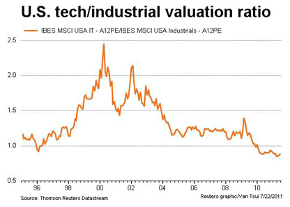
 This chart, inspired by Larry Summers, comes from Felix Salmon. Roughly speaking, it shows the relative valuation of tech companies vs. industrial companies. For the first time in two decades (and possibly the first time ever), the PE ratio of tech companies is lower than the PE ratio of industrial companies. In other words, given a choice between a tech company with earnings of $1 billion and an industrial company with earnings of $1 billion, investors today would pay a higher price for the industrial company. Generally speaking, this means that investors think the industrial company has better long-term growth prospects than the tech company.
So why has this happened? I can take a few guesses:
- The ratio was fairly flat from 2004 until 2009 and then nosedived. For some reason, the recession had a bigger impact on tech companies than industrial companies.
- Older tech companies, like Microsoft, aren’t high flyers anymore, and new tech companies haven’t gone public in big numbers. If tech companies like Facebook and Twitter were holding IPOs in normal numbers, average tech valuation would be higher.
- Investors are still nervous about the dotcom bust and are afraid it could happen again.
- Most of the manufacturing sectors that were in danger of losing their business to overseas competitors have already been decimated. The ones that are left are pretty healthy and unlikely to fall prey to competition from China or Malaysia.
I suspect the real answer is something else, but I don’t know what it is. In any case, I’d like to see this chart decomposed so it’s more obvious why these relative valuations have changed. Has it mostly been because tech PEs have gone down or because industrial PEs have gone up?


