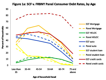
 Here’s an interesting little chart that requires a bit of explanation. For five different categories, it compares the number of households who think they have outstanding loans (solid lines labeled “SCF”) vs. the number of loans that lenders think they’ve given out (dashed lines labeled “Panel”). It provides this comparison for six different age groups. Needless to say, the lender data is highly accurate, so any difference between the two lines means that borrowers are kidding themselves about whether they have any outstanding debt.
For example, the blue lines represent auto loans, and they’re pretty close to each other for all age groups. This means that households have a pretty good idea of whether they owe any money on their cars. Ditto for mortgage loans, home equity loans, and student loans.
But then there’s credit card debt, represented by the red lines. They’re way far apart. In the four working age categories, about 50% of households think they have outstanding credit card debt, but the credit card companies themselves think about 80% of households have outstanding balances. And this shows up in the aggregates, too. Households think they have a total of about $390 billion in credit card debt, while credit card companies think that households owe them about $820 billion.
When I first saw this, I immediately thought I knew the problem. If I were surveyed about credit card debt, I’d report that I didn’t have any. That’s because I pay off my cards every month. But the card companies are probably totting up the charges I’ve already made this month and counting it as outstanding debt. Discrepancy solved!
But guess what? The Fed economists who wrote this report aren’t idiots! They thought of this too:
Reasons for the greater than 50 percent raw difference in aggregate credit card balances may include that (i) unlike the CCP households, SCF households may not have any member with a credit report, (ii) unlike the CCP households, SCF households may omit credit card convenience uses that they intend to repay within the billing cycle and (iii) SCF households may not report business uses of personal credit cards that nevertheless appear on households’ combined credit reports. We make generous allowances for explanations (i) through (iii), including attributing all credit card charges observed within the most recent payment cycle to convenience uses, and find that a 34 percentage point gap in aggregate credit card debt remains.
So what is the answer? The authors don’t have one. Those three explanations are all they have, and even when they control for them there’s still a huge gap remaining. The simplest explanation is probably the right one: American consumers just don’t have any idea how much credit card debt they have.


