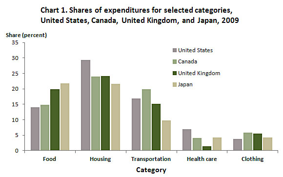
Via Brad Plumer, here’s an interesting chart from the BLS showing how much we spend on stuff compared to a few selected other countries. We spend a lot more on housing than the other countries, somewhat more on healthcare, and quite a bit less on food. Hooray factory farming!
Brad has some commentary to go along with this chart, but I have a different takeaway. Looking at these numbers, it’s hard not to conclude that we have a lot of headroom on healthcare. I could easily see healthcare rising to at least the same level as food expenditures, and maybe as high as transportation too. That could happen because we collectively decide to spend less on food and transportation, or it could happen just by spending the same fixed amount on these items as wages rise, and then plowing all of our additional income into healthcare. On past performance, that might very well be something we do happily.
In other words, it’s true that to some extent rising healthcare expenditures provide their own pushback. When we collectively decide we’re spending too much, we’ll collectively start reining in our spending. But as the chart below makes clear, that time could be quite a way away.


