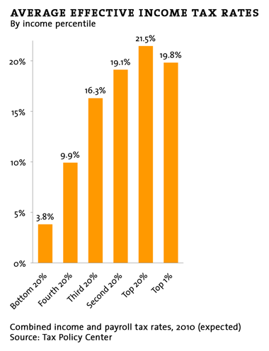
Courtesy of Dave Gilson, here’s a whole bunch of handy charts for tax day to show you who’s paying how much to whom. For example, the chart below shows average effective tax rates for various income levels. Note that the federal tax system as a whole (including both payroll and income taxes) is fairly progressive at the bottom half of the income scale but then flattens out. Someone making an absolutely average income pays about 16.3% of their income in taxes, and that goes up to only 19.8% for someone at the very tippy top. That’s pretty damn flat for an allegedly progressive tax code. More here.


