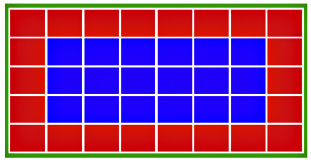
 Quick: does this diagram have more blue squares or more red squares?
Time’s up! There are more red squares. But according to Berkeley’s Eduardo Andrade, most people overestimate the number of blue squares when they’re lumped in the middle like this. Scatter them around in different ways and you can reliably get people to guess that there are more red squares or that there are the same number of both. This makes the visual display of information important:
It is relatively easy to bias people’s visually-based estimates. As experiment 1 demonstrates, estimations of the actual proportion of winning squares differed by almost 30 percentage points when the winning-on-the-edge vs. winning-in-the-middle formats were contrasted (30.7% vs. 57.6%). Surprisingly, people are often tempted to rely on the costless and apparently ‘‘infallible’’ visual input. Experiment 2 showed that an astonishing 75% of participants in the ‘‘pictorial format only’’ condition acknowledged that they did not systematically compute the actual probabilities before making a betting decision that involved their own participation fee.
I don’t know if this is really all that surprising or not, but there you have it. In any case, this reminds me of the old chestnut about why, when you look up something in a map book, the thing you’re looking for always seems to be right on the edge, forcing you to flip back and forth between two pages. Answer: because most of the map is on the edge. The outermost 15% of a page contains half the map. The outermost 20% contains two-thirds. So the odds of finding something near the center seems like it ought to be high but in fact is surprisingly low. Thus the annoyance factor.


