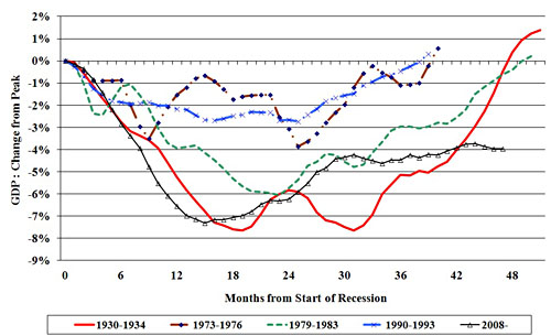
Via Paul Krugman, this is kind of fascinating. Jonathan Portes provides us with this chart, which shows the trajectory in Britain of both the Great Depression and the current Great Recession. The red and black lines at the bottom are the ones to look at:

Now, there’s a bit of cherry picking going on here, I think, since Britain had a nasty recession following World War I and sluggish growth throughout the 1920s, which meant they simply didn’t have as far to fall during the 30s as we did. Unemployment was also worse during the 30s than it is today. So take this with a grain of salt. Nonetheless, it’s sobering: in Britain at least, the Great Recession of 2008 is, in some ways, arguably worse than the Great Depression was.


