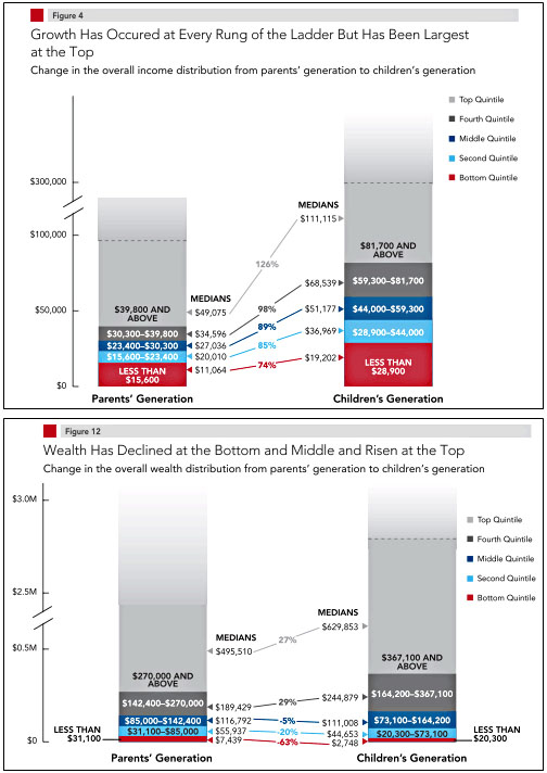
Here’s an interesting pair of charts from the latest release of the Pew Economic Mobility Project. It compares income and wealth between generations at roughly age 45 (though there’s a bit of statistical massaging involved to make the ages similar), and the results are shown below. Income — which includes cash transfers like Social Security and welfare payments, but not non-cash payments like food stamps — has risen for every income level. Wealth, however, hasn’t. Despite making more money than their parents, the bottom three income quintiles have all amassed less wealth. Only the top two income quintiles have done better. The data goes through 2009, so there’s probably a little bit of an artifact from the housing bust, but not a huge one. All figures are adjusted for inflation.
I’m not quite sure what conclusions to draw from this. For now, just consider it an interesting piece of raw data.


