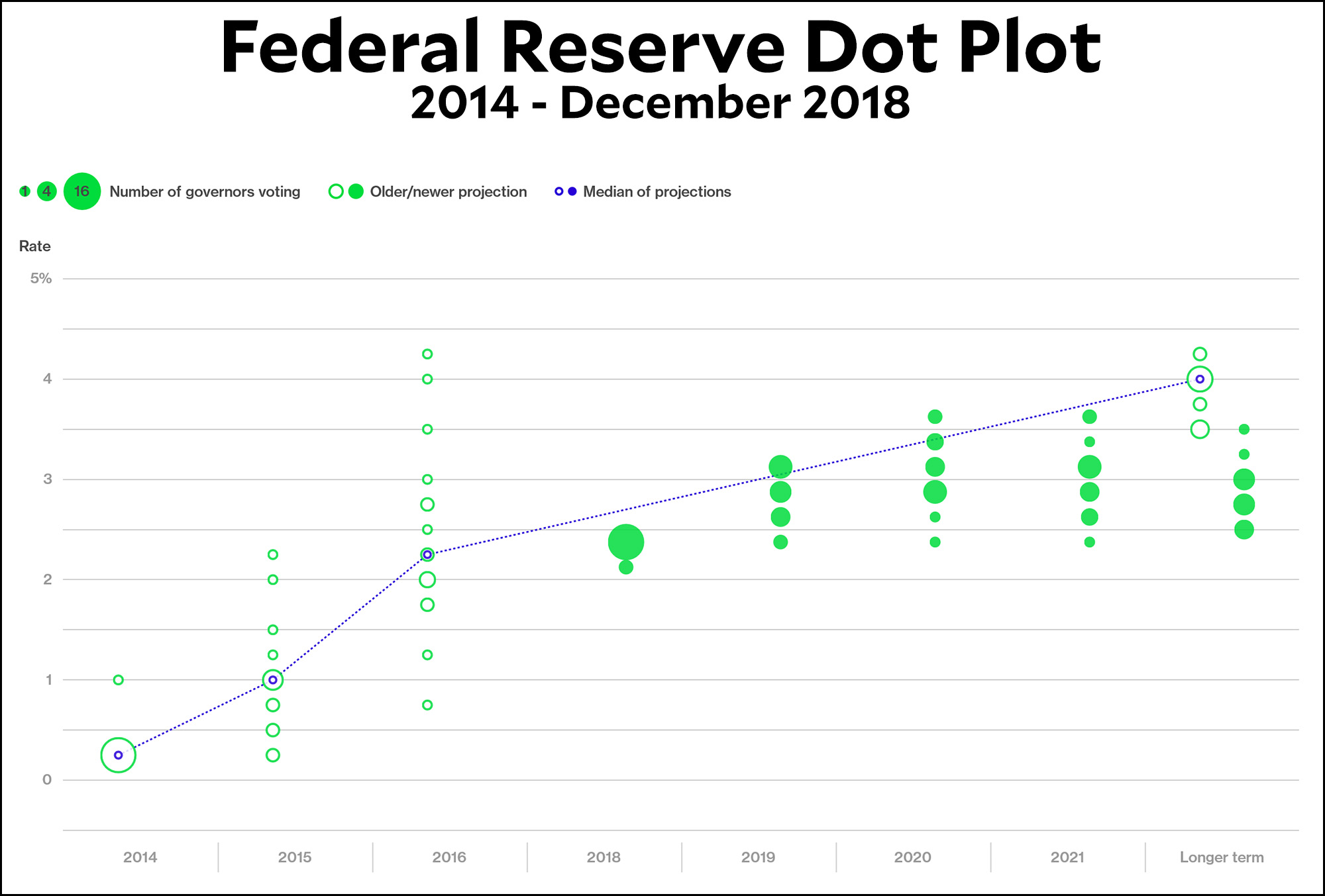
The Wall Street Journal reports today that Fed officials are increasingly nervous about the “dot plot” they release periodically. The dot plot shows how each member of the FOMC projects interest rates over the next few years, with one dot for each member. Here’s a Bloomberg version of the dot plot:

Back in 2014, as you can see, projections were all over the place. They ranged from a 2016 projection of 1.5 percent to a projection of 4.25 percent. Today, however, there’s quite a bit more agreement. The projections for 2019 range only from 2.4 percent to 3.1 percent. The “longer term” projections average around 3 percent, a full percentage point lower than the average FOMC projection back in 2014.
Which isn’t bad, really. A miss of one percentage point over the course of five years is hardly a terrible track record.
But that’s not what anyone cares about. Rather, it appears that the most recent dot plot, released in December, has “rattled” some investors. Why? Because it continues to suggest there could be further rate increases this year even though “top Fed leaders” have “signaled” that rates are on hold. “The dot plot to be released Wednesday would muddy this message if it showed several officials still expect to raise rates this year. Fed Chairman Jerome Powell appeared to pre-emptively play down the projections in a recent speech.”
Needless to say, this is not a problem with the dot plot, which is perfectly comprehensible. It’s a problem with the actual opinions of FOMC members, some of whom may not agree with their top leaders. In fact, it sounds like that’s the real problem here: not that the dot plot is too confusing, but that it’s too transparent. If there are several FOMC members who think interest rates should or will go up, the dot plot makes that crystal clear. There’s no way to hide it using fuzzy language the way they do in their press releases.
So hooray for the dot plot. It is raw data in its rawest form: easy to read and easy to interpret. Leave it alone.


