After posting some numbers for income and consumption among different generations this morning, I found myself diddling around with the Consumer Expenditure Survey later in the day. As I did so, I discovered some anomalies and peculiarities that made me wonder if the stuff I had posted was really very reliable. More about that later. For now, I just want to toss out one of the anomalies. According to the CES, here are average personal income taxes paid over the past few decades:

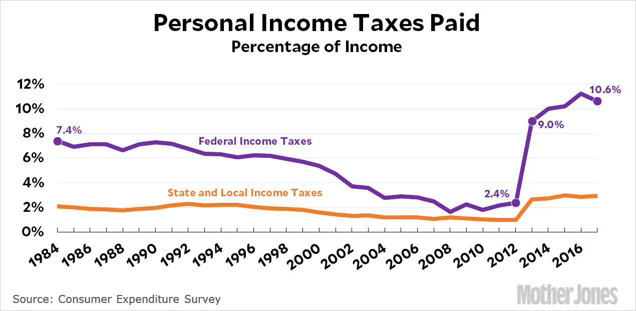
Taxes more than tripled between 2012 and 2013. The chart looks much the same if you display it as percentage of income:

Again, taxes tripled over the course of a single year. The biggest jump is in federal taxes, but state and local taxes also increased a lot from 2012 to 2013.
What’s going on here? Obviously tax payments didn’t really increase that much. Other sources confirm this, and we would have heard screams from sea to shining sea if they had. The only thing that happened in 2013 was that the Bush tax cuts were allowed to expire for the top 1 percent—but an increase of a few percentage points on one percent of the population simply wouldn’t affect things very much. In any case, looking at other tables confirms that the CES records a huge tax jump even for income groups that don’t include the top 1 percent.
This is very peculiar, and I can’t figure out what could be going on here. But I know that a few people who are pretty knowledgeable about this stuff read my blog now and again, so this is a plea for anyone with an explanation to let me know what’s happening.
And while you’re at it, does anyone know why the CES income figures differ so much from the Census figures? They often don’t even agree about whether incomes went up or down, let alone what the precise values are.
UPDATE: The answer turns out to be simple: in 2013 the BLS changed the way it estimated taxes. Instead of surveying people, which produced a lot of nonresponses, they started using NBER’s TAXSIM calculator.
That’s fine, but it means all the tax data before 2013 is useless. If you’re making a time series, it also means that the after-tax income figures are useless. That’s too bad, since changes in tax rates affect the real-world income that households have to spend. But that’s life. Only the before-tax figures are reliable—and I think even that’s at least a little questionable.


