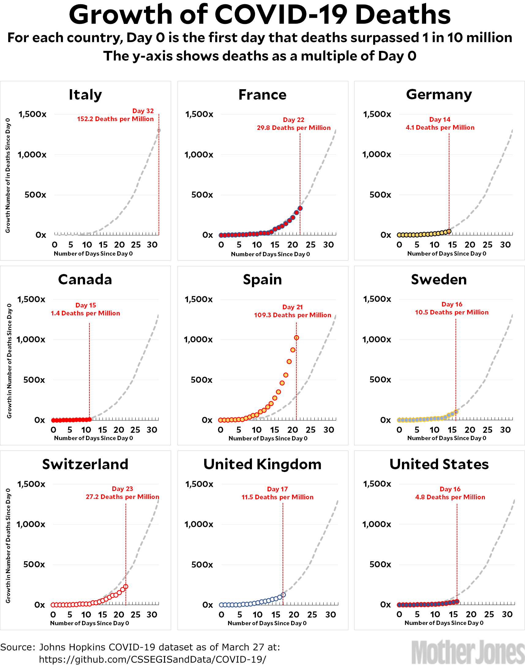
Here’s the coronavirus growth rate through Friday. Nothing much has changed since yesterday. Italy had a bad day, but that made up for a couple of good days and they’re still on roughly the same trendline: peaking in early April and going to zero in early June.
So let’s take a closer look at the United States. It appears to be well below the Italian trendline, which is good news if true. Unfortunately, that’s hard to confirm since the US curve depends a lot on the formula that sets Day 0—and it’s possible that the formula doesn’t scale properly for a country as big as ours. If that’s true, the correct choice of Day 0 might produce a curve that’s right on the Italian trendline, not below it.
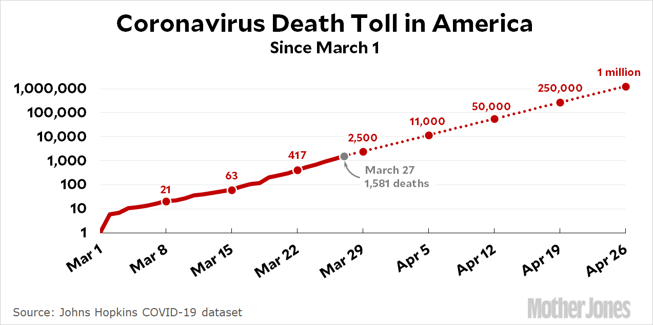
So let’s take a look at something else that shows a little more detail. The chart below displays the total death toll for the US on a log scale. I don’t use a log scale for the main set of charts because it’s confusing for anyone who isn’t fairly proficient in math. However, it’s not hard to understand: as you can see, the y-axis is done in powers of ten, which means that every increase from one line to the next indicates that the number of deaths has been multiplied by ten. The handy thing about this is that exponential curves end up looking like straight lines:

So far, the US death toll is a very precise straight line, which means it’s growing exponentially. If it continues on this path, we’ll hit 2,500 deaths by the end of the week; 11,000 by the end of next week, etc. The big question, therefore, is: how long will it continue on this path? There’s really no way to know for sure, but it’s a good sign when the line starts to flatten out. That hasn’t happened yet. In fact, the line is actually accelerating a bit, though that’s hard to see by eyeballing it.
With no way of predicting the peak based on the US trendline, my best guess is that we’re on the Italian path but two or three weeks behind. I figure they’ll peak in early April, which means we’ll peak in mid-April. Maybe. Needless to say, this depends on our control measures starting to have an effect, which ought to begin this week or next, and it also depends on our control measures being as good as Italy’s and being kept in place for at least a couple of months. For what it’s worth, though, this is close to a new prediction from a team at the University of Washington, which projects a peak in the second week of April and a death toll of 80,000 through June. It would be great if we kept the death toll so low, but unfortunately this projection assumes that every state adopts a total lockdown by next week and keeps it in place through June. I doubt that will happen, which is why I’m more pessimistic than they are.
Here’s how to read the charts: Let’s use France as an example. For them, Day 0 was March 5, when they surpassed one death per 10 million by recording their sixth death. They are currently at Day 22; total deaths are at 332x their initial level; and they have recorded a total of 29.8 deaths per million so far. As the chart shows, this is slightly below where Italy was on their Day 22.
The raw data from Johns Hopkins is here.


