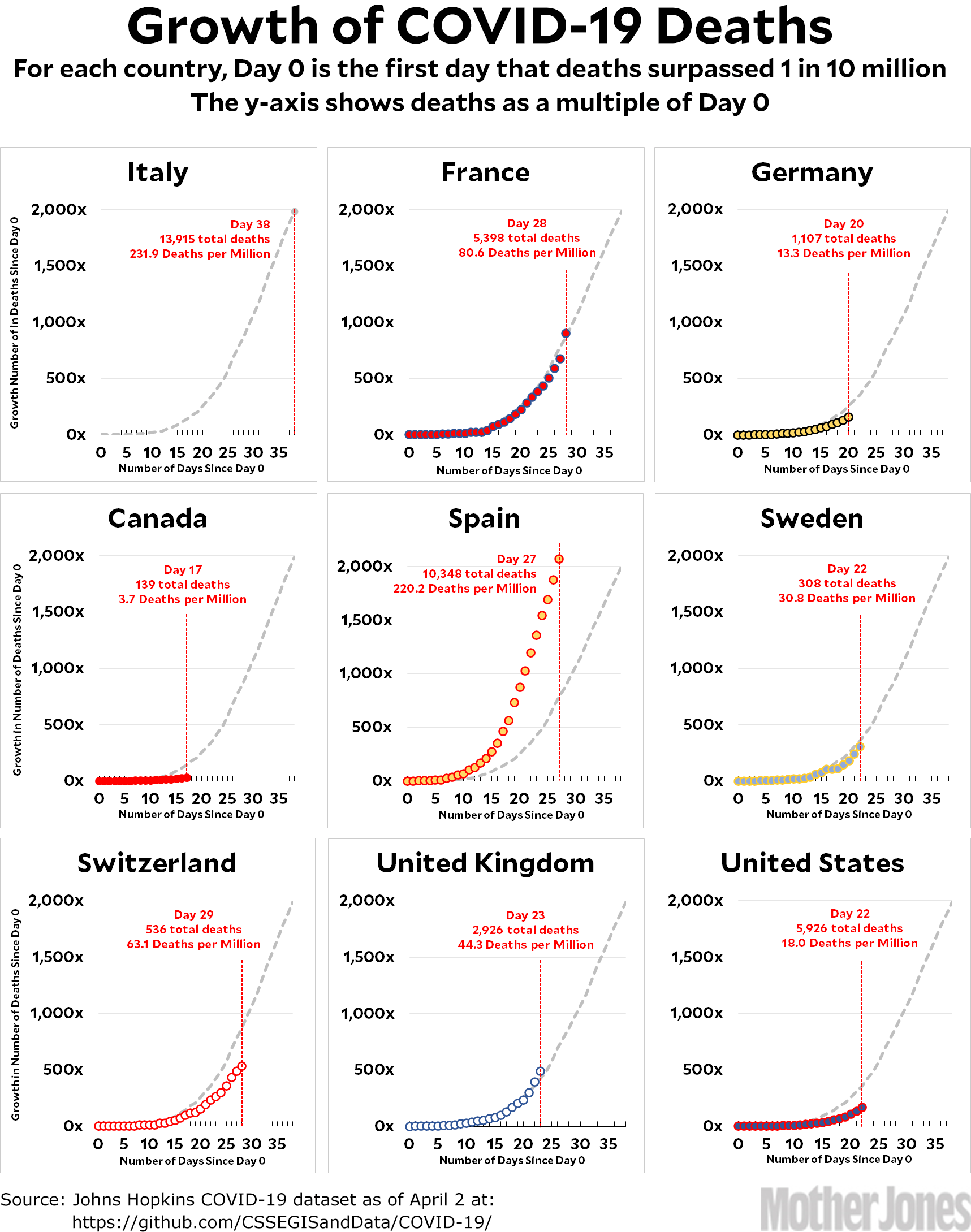
Here’s the coronavirus growth rate through April 2. France had a big jump today and is now right on the Italian track. Spain continues to skyrocket. Britain is now above the Italian track. And the United States recorded its first day with more than a thousand deaths. On the bright side, Italy now looks like it’s definitely starting to decline from its peak.
I’ve gotten a few questions about death rates recently. As you recall, a while back I switched from tracking cases to tracking deaths because the case numbers were too inaccurate. Now, however, there are questions about whether countries are even counting deaths accurately. And if they aren’t, how does that affect the charts?
Not much, I think. There’s been no suggestion that different countries are counting deaths differently, nor that the counts have changed over time. It’s mostly a matter of people dying at home and not getting counted. There are also legitimate questions of what “counts” as a coronavirus death. In any case, I don’t think any of this shows up as a systematic difference either between countries or over time, so the charts are still reasonably accurate. But it’s something to keep an eye on.
How to read the charts: Let’s use France as an example. For them, Day 0 was March 5, when they surpassed one death per 10 million by recording their sixth death. They are currently at Day 28; total deaths are at 900x their initial level; and they have recorded a total of 80.6 deaths per million so far. As the chart shows, this is exactly where Italy was on their Day 28.
The raw data from Johns Hopkins is here.


