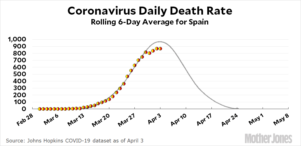
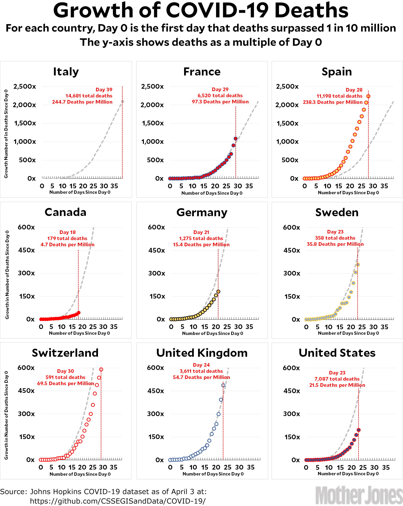
Here’s the coronavirus growth rate through April 3. France had another big jump and is now above the Italian trendline. Spain continues to skyrocket and will surpass Italy in deaths per million by tomorrow. On the bright side, Spain looks like it’s finally getting close to its peak:

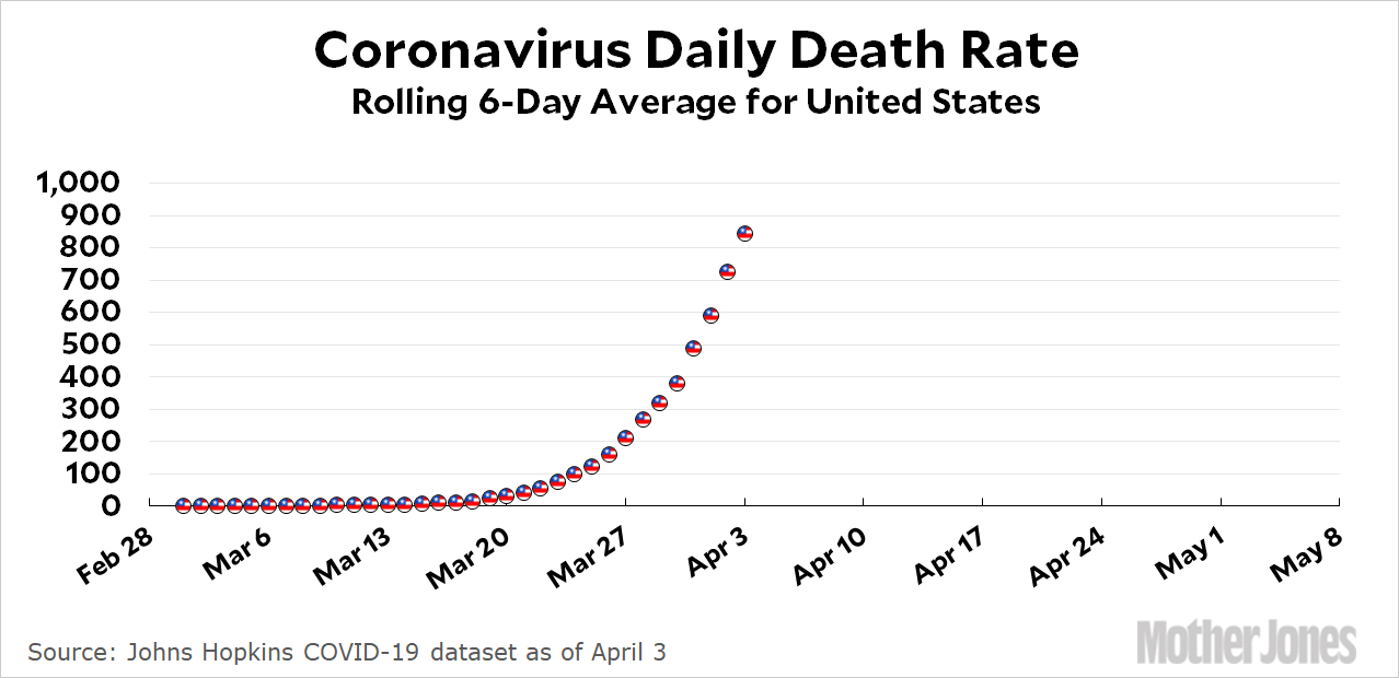
The data has gotten a little noisy over the past few days, but there are obviously signs of flattening here. However, it’s still too early to try to fit a curve to the United States, which remains solidly in its exponential phase:

The model currently in favor at the White House predicts that mortality in the US will peak at 2000-2500 deaths per day, but I wouldn’t be surprised if it ends up above that.
I made some changes today. The scale for Italy and Spain is so big that it’s getting hard to read the charts for everyone else. So I’ve put the three countries with the largest outbreaks on the top row and the other six below with a more compressed scale. I like having the same scale for everyone, but I think it’s outlived its usefulness.
How to read the charts: Let’s use France as an example. For them, Day 0 was March 5, when they surpassed one death per 10 million by recording their sixth death. They are currently at Day 29; total deaths are at 1,087x their initial level; and they have recorded a total of 97.3 deaths per million so far. As the chart shows, this is above where Italy was on their Day 29.
The raw data from Johns Hopkins is here.


