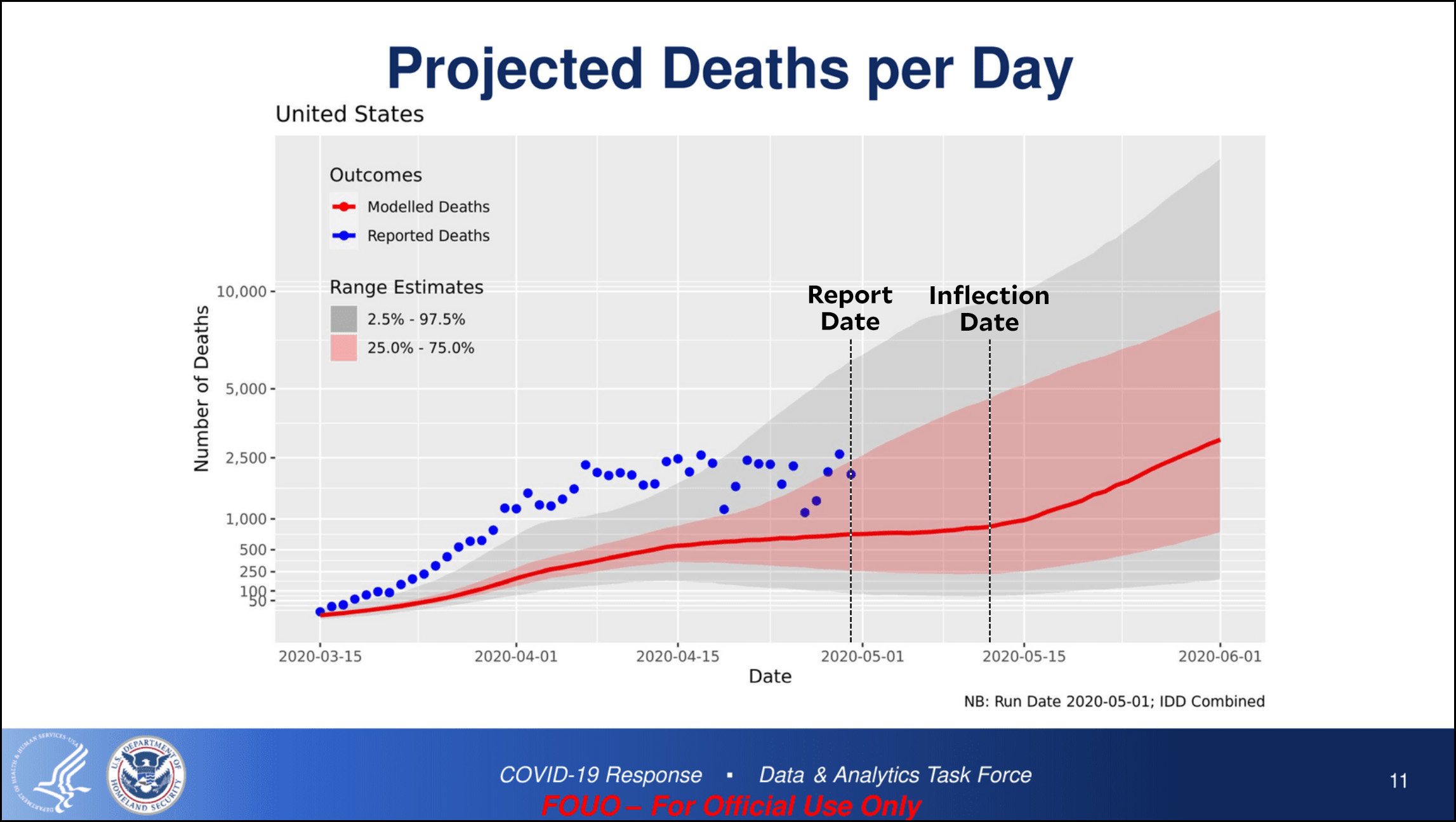
Now that I’ve had some time to breathe, let’s take another look at that FEMA/CDC chart that was leaked earlier today:
There are two things that jump out at me:
- The model (red line) has been consistently conservative. The actual death toll (blue dots) has been 3-4x higher.
- The red line isn’t merely a trendline that extends the existing data. It plateaus at the end of April and then projects a sudden surge upward in mid-May. Something specific has to be causing this. Normally, you’d expect that it’s because the model shows the number of cases starting to surge now, but that’s not so. The model shows a surge in cases starting at about the same time as the surge in deaths. This is peculiar.
The White House has pushed back against this projection: It is a work in progress; the modeling was not complete; it was not intended to be a forecast; etc. Nevertheless, when CDC put together its May briefing deck, this is the model they chose to highlight. It’s not plausible that it was just one of many models that someone scraped off the floor and randomly chose to include. Someone took it very seriously.
Justin Lessler, who created the model, said it wasn’t intended to be a forecast. The Washington Post reports that “Lessler insisted, however, the numbers show how moving to reopen the country could spiral out of control. He said 100,000 cases per day by the end of the month is within the realm of possibility. Much depends on political decisions being made today.” The “political” decisions being made today have to with (a) reopening the states and (b) planning for massively increased testing. Right now, we’re getting too much of the former and too little of the latter.
Without a detailed description of the model assumptions and inputs from Lessler, we can only make a best guess: he plugged in the likelihood of states opening up alongside the obvious lack of test-and-trace being put in place and the model predicted that deaths would start to rise again in mid-May.
This is just a model. As I’ve written before, there are lots of models out there and they all say different things. Nonetheless, the White House owes us a straight answer about this one, preferably from the mouth of Anthony Fauci or someone like that. It’s simple arithmetic to convert the chart above into total deaths, and what it projects is about 130,000 deaths by June 1 and something like 200,000 deaths by June 30 if we assume a rough plateau through the month. That would then double or more as we pass the peak and the daily death rate starts to decline, giving us a total of 400-500,000 deaths by the end of summer.
Obviously I hope that this is all some huge mistake, meant solely for worst-case FEMA planning purposes. But until we get a credible and detailed explanation of where this projection came from and why it’s being briefed to a lot of people, I have a hard time accepting that. In the meantime, can we for God’s sake stop reopening states? At least until we have a better idea of where we’re really at? In Europe, most countries have managed to adhere to lockdowns for upwards of eight weeks now. Surely we can do as well?