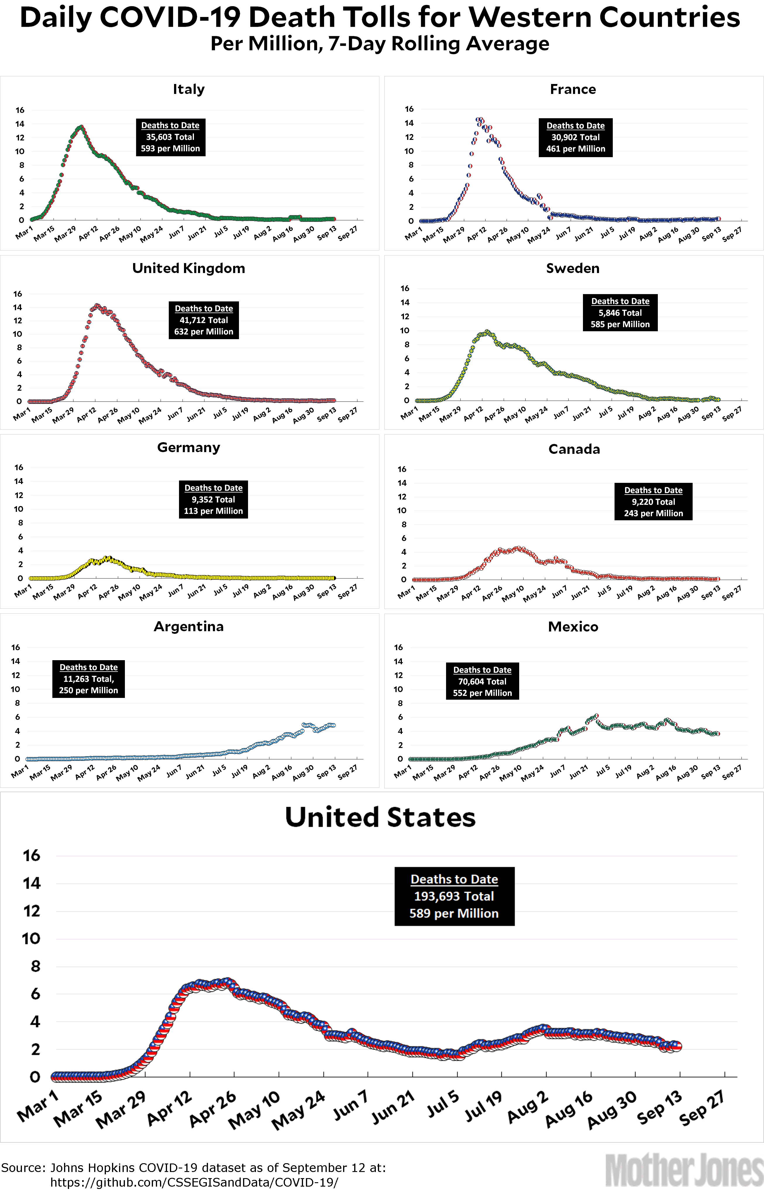
Here’s the coronavirus death toll through September 12. The raw data from Johns Hopkins is here.
In yesterday’s survey, supporters of putting all the charts on the same scale won an overwhelming victory with 78 percent of the vote. Sadly, in the Electoral College the other side eked out a close win, so we’ll be sticking with the old format.
Ha ha. Just kidding. I am a slave to popular opinion, and from now on we will be using the same scale for all charts. In truth, I don’t really mind anymore. When I first started these charts, the numbers were so low that you truly couldn’t see anything on some of them if I used a large scale. However, these days there’s a pretty full upswing and downswing for everyone, and it shows up fine no matter what scale I use. So every country will now be charted on the 0-16 scale, which hopefully will never have to be made any larger.


