• Newer, More Infectious Strain of Coronavirus Has Taken Over the World

    This is a little down in the weeds, but you might not have heard about it before. A new mutation of the coronavirus appeared in Europe back in February and has quickly become the dominant strain nearly everywhere in the world. Here are the official—but incomprehensible—pretty charts from the paper describing the new strain:

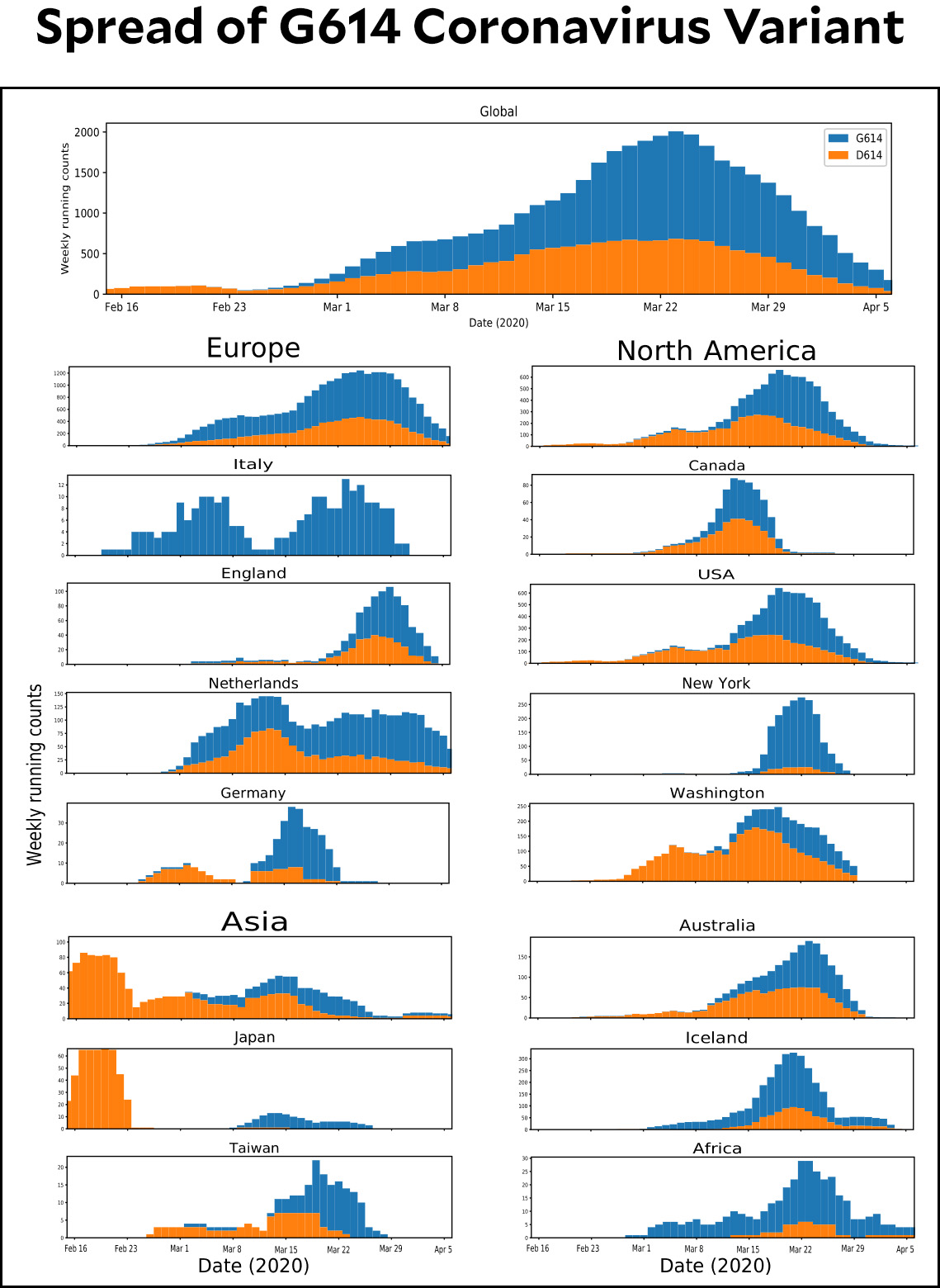
    Wait. Weekly running count of what? And why are the counts decreasing? And if they’re weekly, why are the bars daily?

    I have hunted through the paper for an explanation but basically come up dry. As near as I can tell, the answers are:

    • It’s a running count of the samples submitted to GISAID, the Global Initiative on Sharing All Influenza Data.
    • They have lots of submissions from mid-March but not yet very many from April.
    • The bars are daily because . . . um, I don’t know. But if you add up the bars that fall on a weekly date, you’ll get about the same number as the cumulative chart in the supplementary materials. So those are really the only bars that matter.

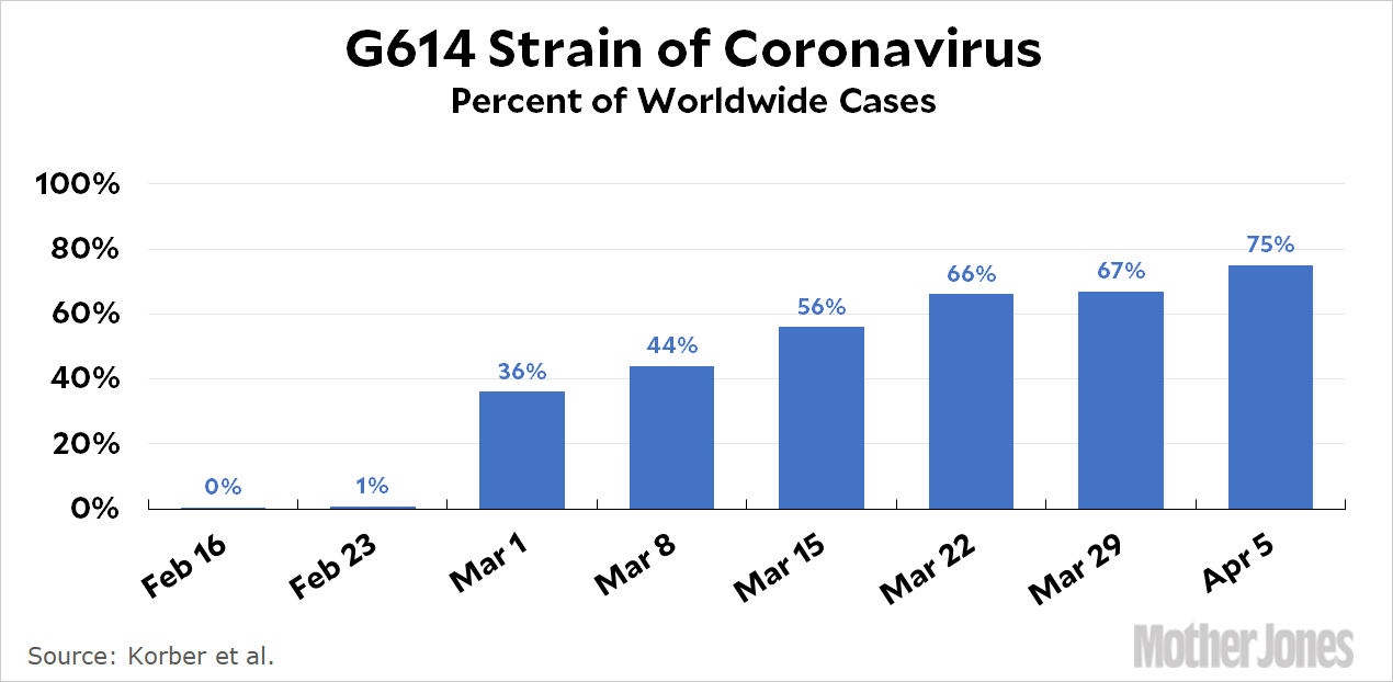
    What this adds up to is simple: the absolute numbers don’t really mean anything. For our purposes, the most useful chart is a weekly presentation of the percentage of the G614 strain. So here that is:

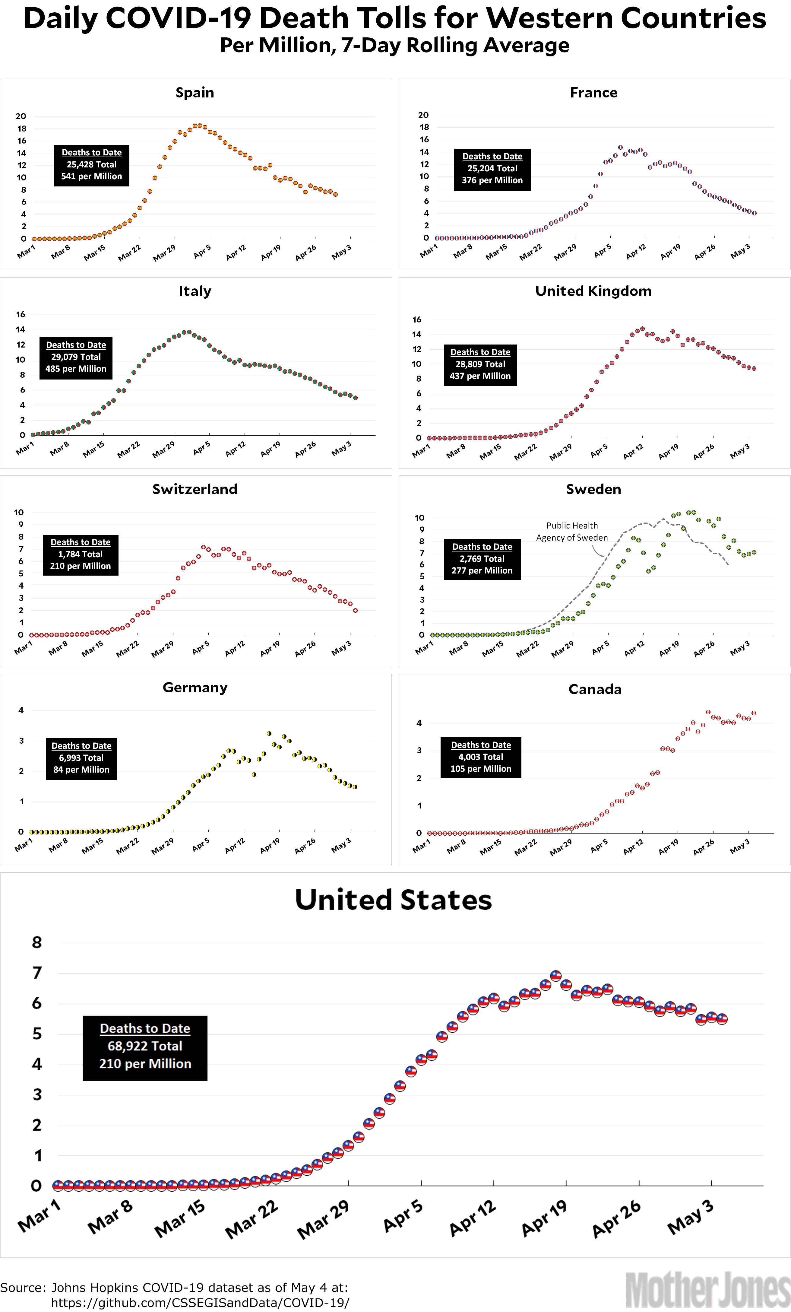
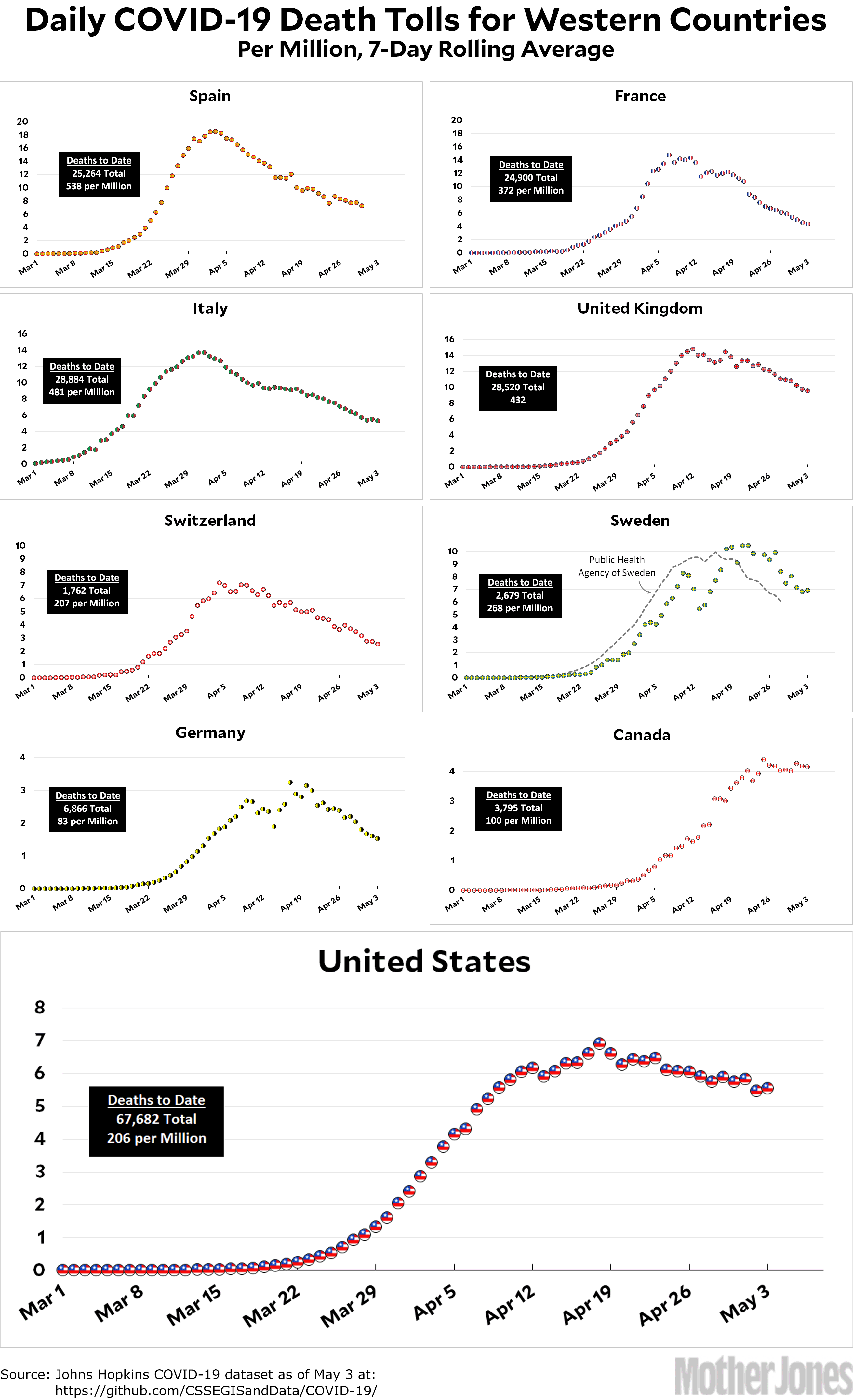
    As I’ve said before, projections of COVID-19 deaths mainly depend on estimates of how good each country’s (or state’s) countermeasures are and how many people comply with them. But mutations of the coronavirus matter too. This one isn’t hugely more dangerous than the original strain, but it’s a little more deadly.

  • Coronavirus Growth in Western Countries: May 4 Update

    Here’s the coronavirus death toll through May 4. It took the United States seven days to go up from 6 deaths per million to 7 deaths per million. It took seven more days to go back down to 6 deaths per million. So far, though, after nine days we’re only about halfway from 6 deaths per million to 5 deaths per million. The slope of our decline is very definitely getting flatter.

    Which will be the first country to get down to 0.5 deaths per million? At the moment, my money is on Switzerland.

    The raw data from Johns Hopkins is here. The Public Health Agency of Sweden is here.

  • Has America Become Weak and Sniveling?

    Kevin Drum

    One of the things the COVID-19 pandemic has highlighted is the American public’s unwillingness these days to see a fight through. Consider:

    • After only a few weeks of lockdowns, Americans seem barely willing to continue fighting COVID-19.
    • After the financial crash, Americans were willing to support only a half-baked stimulus, and for less than a year, before they panicked over the national debt and supported it no longer.
    • Americans gave up on the Iraq War very quickly after not winning an instant victory. By 2004 even supporters had gotten tired of it.

    All of these things have a political valence to them. Conservatives fought the stimulus from the beginning and lockdowns within a few weeks. Liberals mostly opposed the Iraq War from the beginning. This obviously makes it way harder to demand sacrifices from the public for a long period.

    This is hardly unique to Americans and hardly unique to politically volatile topics. Still, it’s hard not to think that it’s getting worse—both because Americans are too comfortable and partisan polarity has become so pervasive. It took many years for people to get tired of, for example, World War II, the Cold War, and the Vietnam War. Probably not coincidentally, all three had broad bipartisan support among the mainstream.

    Asking for sacrifice is always hard, but you’d think that something like a deadly pandemic would finally be enough to do it. Surely for a few months at least. But after it was inexplicably turned into a partisan affair, half the country started to turn against it despite overwhelming evidence from around the world about what needed to be done.

    It’s hard to think of anything less inherently partisan than a pandemic. It’s also hard to think of anything better suited to a purely expert response. And yet experts are mostly used as props by the White House and the response has become almost comically partisan.

    Is there anything left that would bring liberals and conservatives together to demand some kind of sacrifice from the American public? And even if that happened, would the public respond? I’m starting to wonder.

  • Lying With Statistics, COVID-19 Edition

    After this morning’s leak of the CDC projection of COVID-19 deaths, the White House pushed back and said it would continue to use its own internal modeling:

    A senior White House official said the document would not change the White House planning on reopening. White House officials have been relying on other models to make decisions on reopening, including the IHME model and a “cubic model” prepared by Trump adviser and economist Kevin Hassett and the Council of Economic Advisers.

    This has prompted a considerable amount of chuckling in my Twitter feed. First, though, here’s what a cubic function looks like:

    Roughly speaking, a quadratic function, familiar from high school geometry, always goes up and then down (or down and then up). That’s it. A cubic usually goes up down up (or down up down). They are both fine polynomials, but when it comes to trendlines there aren’t many circumstances that call for using a cubic function to fit a bunch of dots in a chart. However, there are occasional reasons. For example, here’s the daily death toll from CV19 up through May 3, fitted with a cubic curve:

    What’s the point of using a cubic to fit this curve? It doesn’t even go up down up! Well, a cubic fit gives you an extra parameter to play with, which means it’s easier to generate a result you like. In this case, it projects that deaths will drop to zero in about two weeks. This is neither particularly honest nor particularly likely, but I imagine the White House likes it.

    Another reason to use a cubic fit is if you have a credible underlying model that suggests you should use it. For example, if you see that states are opening up and people aren’t taking social distancing seriously enough, your model might tell you that the downward trend is bound to turn back up. This calls for a curve that goes up, then down, then up again. A cubic. In the chart below, I’ve added a month’s worth of projected data and then overlaid it with a cubic trendline:

    Now, these are both made-up curves (though the data points are real) and are meant as illustrations only. But they show how easy it is to produce the results you want if you’re willing to torture the data a bit. It turns out, for example, that these trend curves are very sensitive to the starting date. So by choosing the starting date carefully and then fitting a cubic curve, you have a lot of leeway to produce what you want.

    Anyway, the irony here is that thanks to President Trump’s campaign to reopen the country, it’s entirely likely that a cubic actually is the best fit of the data. Just not the particular cubic that Hassett and his pals are probably using.

  • More About That FEMA/CDC Report

    Now that I’ve had some time to breathe, let’s take another look at that FEMA/CDC chart that was leaked earlier today:

    There are two things that jump out at me:

    • The model (red line) has been consistently conservative. The actual death toll (blue dots) has been 3-4x higher.
    • The red line isn’t merely a trendline that extends the existing data. It plateaus at the end of April and then projects a sudden surge upward in mid-May. Something specific has to be causing this. Normally, you’d expect that it’s because the model shows the number of cases starting to surge now, but that’s not so. The model shows a surge in cases starting at about the same time as the surge in deaths. This is peculiar.

    The White House has pushed back against this projection: It is a work in progress; the modeling was not complete; it was not intended to be a forecast; etc. Nevertheless, when CDC put together its May briefing deck, this is the model they chose to highlight. It’s not plausible that it was just one of many models that someone scraped off the floor and randomly chose to include. Someone took it very seriously.

    Justin Lessler, who created the model, said it wasn’t intended to be a forecast. The Washington Post reports that “Lessler insisted, however, the numbers show how moving to reopen the country could spiral out of control. He said 100,000 cases per day by the end of the month is within the realm of possibility. Much depends on political decisions being made today.” The “political” decisions being made today have to with (a) reopening the states and (b) planning for massively increased testing. Right now, we’re getting too much of the former and too little of the latter.

    Without a detailed description of the model assumptions and inputs from Lessler, we can only make a best guess: he plugged in the likelihood of states opening up alongside the obvious lack of test-and-trace being put in place and the model predicted that deaths would start to rise again in mid-May.

    This is just a model. As I’ve written before, there are lots of models out there and they all say different things. Nonetheless, the White House owes us a straight answer about this one, preferably from the mouth of Anthony Fauci or someone like that. It’s simple arithmetic to convert the chart above into total deaths, and what it projects is about 130,000 deaths by June 1 and something like 200,000 deaths by June 30 if we assume a rough plateau through the month. That would then double or more as we pass the peak and the daily death rate starts to decline, giving us a total of 400-500,000 deaths by the end of summer.

    Obviously I hope that this is all some huge mistake, meant solely for worst-case FEMA planning purposes. But until we get a credible and detailed explanation of where this projection came from and why it’s being briefed to a lot of people, I have a hard time accepting that. In the meantime, can we for God’s sake stop reopening states? At least until we have a better idea of where we’re really at? In Europe, most countries have managed to adhere to lockdowns for upwards of eight weeks now. Surely we can do as well?

  • Lunchtime Photo

    Spaceport of the Gods?

    Ha ha, of course not. This is just a typical western mesa, a product of differential erosion. Any geologist can tell you that the mesa itself consists of sandstone, limestone, and other rocks that resist erosion, while the surrounding rocks are mostly softer shales. Over millions of years, the softer rocks erode, leaving the mesa towering above the rest of the land. There’s no need to invoke conspiracy theories to explain this. I mean, it’s not as if geologists are all part of a government scheme to hide the evidence of how intelligent life really evolved on Earth.

    Right? Of course not.

    January 26, 2020 — Washington County, Utah
  • CDC Seems to Project Half a Million Deaths From COVID-19

    We are so fucked:

    As President Trump presses for states to reopen their economies, his administration is privately projecting a steady rise in the number of cases and deaths from the coronavirus over the next several weeks, reaching about 3,000 daily deaths on June 1, according to an internal document obtained by The New York Times, nearly double from the current level of about 1,750.

    The projections, based on modeling by the Centers for Disease Control and Prevention and pulled together in chart form by the Federal Emergency Management Agency, forecast about 200,000 new cases each day by the end of the month, up from about 25,000 cases now.

    Would you like to see this in approximate chart form?

    If I’ve done the arithmetic without too many mistakes—which is a little hard because my hands are shaking—this adds up to something in the ballpark of 200,000 deaths by the end of June. And even that’s only if the number of deaths starts to plateau in early June, which is not what the CDC’s own chart suggests:

    If anything, this looks as if CDC thinks June 1 isn’t a peak, but just a mile marker on our way up. But even if we go ahead and assume optimistically that 200,000 is the right estimate for the end of June, we’ll also have another 200,000+ as we decline after the peak. Call it half a million deaths total. And even that’s just for the first wave of COVID-19.

    HALF A MILLION DEATHS.

    I suppose it’s possible that the CDC is completely off base. But . . . probably not.

    HALF A MILLION DEATHS.

    Words are failing me. Do they really believe this? And they’re keeping it a secret while Donald Trump says everything is OK and we should start reopening the economy? Will someone please tell me that this was just some intern screwing around with a spreadsheet that accidentally got into the hands of the New York Times? Or a fat finger error? Or a decimal place that got dropped?

    ARE THEY SERIOUSLY KEEPING IT A SECRET THAT THEY EXPECT HALF A MILLION DEATHS FROM COVID-19?

    UPDATE: I’ve added the CDC chart and changed a few sentences here and there to discuss it.

    UPDATE 2: More from the Washington Post:

    The White House and the Centers for Disease Control and Prevention quickly disavowed the report, though the slides carry the CDC’s logo. The creator of the model said the numbers are unfinished projections shown to the CDC as a work in progress. The work contained a wide range of possibilities and modeling was not complete, according to Justin Lessler, an associate professor of epidemiology at the Johns Hopkins Bloomberg School of Public Health, who created the model.

    He said he didn’t know how the update was turned into a slidedeck by government officials and shared with news organizations. The data was first reported by the New York Times.

    “I had no role in the process by which that was presented and shown. This data was presented as an FYI to CDC … it was not in any way intended to be a forecast,” Lessler said. Lessler insisted, however, the numbers show how moving to reopen the country could spiral out of control. He said 100,000 cases per day by the end of the month is within the realm of possibility. Much depends on political decisions being made today.

    More to come on this, I’m sure.

  • California’s Red Counties Are Revolting

    Here in California, sparsely populated red counties are in revolt:

    Yuba and Sutter counties in Northern California are set to allow many businesses to reopen Monday in defiance of Newsom’s statewide stay-at-home order….Modoc County, with fewer than 9,000 residents, allowed all businesses, schools and churches to reopen Friday as long as people inside could stay six feet apart. The move by Yuba and Sutter counties — with a combined population of 171,000 people and just 50 coronavirus cases and three deaths — comes as other California counties on the Central Coast and San Joaquin Valley are demanding to reopen more businesses.

    Here’s the daily death toll in California:

    Does this look like it’s time to let our foot off the brake? Or should we give things a wee bit more time before caving in and risking a resurgence of the virus?

  • Coronavirus Growth in Western Countries: May 3 Update

    Here’s the coronavirus death toll through May 3. Just by eyeball, it looks like Switzerland and France are a week or ten days away from zero deaths. Italy, Germany, and Sweden are two weeks out. Spain and the UK are three weeks away. Canada is unpredictable. And the US is about ten weeks out. Needless to say, all of this is based on the existing trends continuing without change, which is far from certain.

    The raw data from Johns Hopkins is here. The Public Health Agency of Sweden is here.

  • Fun With Food Coloring

    A couple of years ago I bought some food coloring with the idea of dropping it into water and taking pictures of the swirls. Unfortunately, it turned out that I was missing a crucial piece to make this work and I ended up never going back to it. Yesterday morning, though, I opened a cupboard and happened to notice the package of food coloring. It was taunting me. So I got it out and finished the job.

    In these pictures, Marian was the artistic technician, dropping the coloring into the water in ways that would hopefully make interesting patterns. I was the hired muscle, pressing the shutter button over and over to get a nice, large batch of photos. Here are four of them.