• Democrats Took a Terrible Coronavirus Bill and Made It Pretty Damn Good

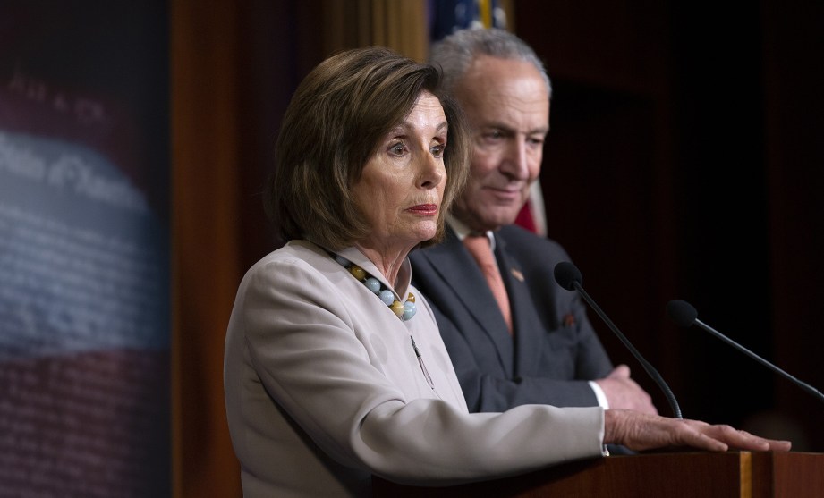
    Stefani Reynolds/CNP via ZUMA

    A week ago Republicans introduced the first version of their coronavirus rescue bill. Here’s what Democrats have gotten added to it since then:

    • Vastly expanded unemployment benefits through June for anyone who’s lost income due to COVID-19.
    • $100 billion for hospitals.
    • A change in the “checks for everyone” program to insure that low-income workers get the full $1,200.
    • Removal of a provision that would have excluded nonprofits that receive Medicaid funding from the small-business grants.
    • A ban on the Trump family getting aid.
    • Oversight on the corporate lending facility.
    • $150 billion for state and local governments.
    • $25 billion for food stamps.
    • $30 billion for schools.

    Is this perfect? No.

    Are there any objectionable parts of the bill still included? Yes.

    Did Democrats get every last thing they wanted? No.

    Is this nonetheless a damn good effort that’s going to help millions of ordinary Americans get through the crisis without being evicted, going bankrupt, or continuing to work in unsafe conditions? Oh yes indeed.

    Love ’em or hate ’em, this is good work from the Democratic Party. It’s only because of the final form of this bill that we have a fighting chance of getting through the coronavirus pandemic without destroying the economy along the way.

  • Lunchtime Photo — Throwback Thursday

    This is one of my very oldest digital pictures, taken in 2001 on a corporate outing to Switzerland. It shows the city walls of Lucerne in the morning mist, and luckily for us Photoshop has restored it to a halfway decent condition. The accompaniment is a Vivaldi oboe concerto with my (distant) Swiss cousin Heinz Holliger on the oboe. It’s a soothing tune for these stressful days.

    October 10, 2001 — Lucerne, Switzerland

  • Back to Work, Billionaires Say

    Kudos to the LA Times copy editor responsible for this headline:

    The story itself is from Bloomberg:

    The billionaire Tom Golisano was smoking a Padron cigar on his patio in Florida on Tuesday afternoon. He was worried. “The damages of keeping the economy closed as it is could be worse than losing a few more people,” said Golisano, founder and chairman of the payroll processor Paychex Inc. “I have a very large concern that if businesses keep going along the way they’re going, then so many of them will have to fold.”

    When the revolution comes, at least now we know who will be first up against the wall.

  • Chart of the Day: Unemployment Claims Are Up!

    Here’s the chart everyone has been waiting for:

    I hope we don’t all go crazy over this. After all, we basically ordered 3 million people to stop working, so it’s hardly a surprise that 3 million people filed claims for unemployment compensation. I’ll bet next week is going to be pretty high too.

    In any case, this is your chart porn for the week. I hope Donald Trump doesn’t successfully use it as an excuse to try to end all the control measures we’ve put in place to slow down the spread of coronavirus.

  • Coronavirus Growth in Western Countries: March 25 Update

    Here’s the coronavirus growth rate through Wednesday. I’ve corrected a small error in the Swedish chart, but there are otherwise no big changes to note. As usual, Switzerland and the United States are doing better than the Italian trendline while Spain is doing a lot worse. Everyone else is pretty close to the Italian path.

    The Italian death rate continues to decelerate. Here’s another look:

    This is a simple four-day rolling average of the day-to-day growth, and it suggests that growth will go to zero in the four-day period from April 3-6. If this holds up, growth will then turn negative until the death toll reaches zero in early May. This shows the same thing as my previous charts, in which I roughly fit a normal curve to the Italian death toll.

    Here’s how to read the charts: Let’s use France as an example. For them, Day 0 was March 5, when they surpassed one death per 10 million by recording their sixth death. They are currently at Day 20; total deaths are at 222x their initial level; and they have recorded a total of 19.9 deaths per million so far. As the chart shows, this is slightly below where Italy was on their Day 20.

    The raw data from Johns Hopkins is here.

  • $2.2 Trillion Coronavirus Rescue Bill Passes Senate Unanimously

    This pile of money the Joker is burning may look impressive, but it's only a few billion dollars.Warner Brothers

    After all the last-minute posturing and outrage, not a single senator opposed the coronavirus rescue bill:

    The sprawling legislation, which passed 96-0, would send checks to more than 150 million American households, set up enormous loan programs for businesses large and small, pump money into unemployment insurance programs, greatly boost spending on hospitals, and much more.

    On Monday it was a $1.8 trillion bill. Then it was $2 trillion. Now it’s $2.2 trillion. That’s $400 billion casually tacked on over the course of four days. The Senate literally took the entire annual cost of the Obama stimulus program and tossed it into the pot as a sort of sweetener to buy votes.

    This is especially impressive because I can’t find a reliable source to tell me exactly what that $400 billion is for. I mean, sure, it may not seem like much in the great scheme of things, but it still represents 25,000 tons of hundred-dollar bills. That’s a lot!

  • What Do We Call a Deliberately Engineered Recession?

    Heather Long writes about the $2 trillion coronavirus rescue bill:

    The good news is the majority of the money is going to laid-off workers, small business owners, hospitals and state and local governments. The bad news is it won’t be enough to stop a recession. And it’s an open question whether the nation can avoid an economic depression, the likes of which haven’t been seen since the 1930s.

    I continue to be a little perplexed about this. Is it really a recession if it’s caused by the government stepping in and literally ordering businesses to reduce their output? Technically, I suppose so. GDP goes down, employment goes down, and consumption goes down. Those are all the markers of a recession.

    And yet . . . help me out here. It’s not the same thing, is it? Or am I missing something? It almost seems as if there ought to be another name for a deliberately engineered economic slowdown like this one that will end just as soon as the government orders it to end. Take this, for example:

    It’s apparently true that real estate investors are in panic mode right now, but it’s not so much because the value of real estate has truly plummeted; it’s only because deals are frozen due to government lockdown orders.¹ Nobody wants to buy while the coronavirus lockdown is in effect, which means that technically markets are in freefall. This is bad news for those who are unlucky and have to sell right now, but for most real estate owners it doesn’t mean anything much at all. There might be some footnotes that have to be added to their balance sheets, but they’re temporary and affect nothing. They just have to ride it out for a few months. In a real recession, you’d be afraid that your holdings have lost value forever.²

    So what do we call this? A fauxcession? A coronacession? A pandemicession? Any ideas?

    ¹There are probably exceptions, of course. For example, the chart suggests that the value of senior housing is down the most, which makes sense. It’s all a bit ghoulish, but if the coronavirus ends up killing a lot of the elderly, then there will be less demand for senior housing and its value will decline.

    On the other hand, why would anyone think that student housing is down 30 percent in any real sense of the word? When the pandemic ends, there are going to be just as many students as there were before.

    ²Or, to be more accurate, for an indeterminate but longish time.

  • Lunchtime Photo

    As near as I can tell, these are both pictures of Western blue-eyed grass. But one is blue and the other is purple. Likewise, one has rounded petals and the other has pointy petals. They sure don’t look like the same flower to me. And yet they are.

    April 20, 2019 — Laguna Coast Wilderness Park, Orange County, California
  • Coronavirus Rescue Bill Will Be Our Biggest Stimulus Since World War II

    Apparently we have reached agreement on the Senate’s $2 trillion coronavirus rescue bill. Not much has changed since Sunday except that an inspector general will oversee the $500 billion corporate lending facility that’s part of the bill.

    The astonishing part of all this is that virtually all of the money in this bill is meant to be spent over the next six months or so. That’s about 20 percent of GDP, which isn’t far off the amount we spent on World War II—though obviously that spending lasted considerably longer. By contrast, the 2009 stimulus bill spent roughly $400 billion per year, or a little under 3 percent of GDP.

    This is a gigantic bill. Just to give you a sense of scale, here’s what it looks like in the context of the overall budget deficit on an annual basis. World War II is literally the only comparable period in recent history.

  • Coronavirus Growth in Western Countries: March 24 Update

    Here’s the coronavirus growth rate through Tuesday. There are no big changes since yesterday aside from a sudden flattening of the growth curve in Switzerland. We’ll see if that holds for the rest of the week. Here’s the curve for Italy that I posted yesterday, updated by a day:

    This has a significantly lower peak than yesterday. It still suggests an endpoint in early May, but the total death toll now pencils out to about 22,000, or 0.036 percent of Italy’s total population. Here’s another version of the curve that uses cumulative deaths and therefore has much less noise. It shows the same thing:

    If this holds up, it shows just how effective strict control measures can be. The hard part is going to be keeping them in place all the way through the end of April even as the death rate plummets. People are going to get very itchy about staying at home all the time when it seems like the news is so positive, but it has to be done all the way down to zero.

    Here’s how to read the charts: Let’s use France as an example. For them, Day 0 was March 5, when they surpassed one death per 10 million by recording their sixth death. They are currently at Day 19; total deaths are at 184x their initial level; and they have recorded a total of 16.4 deaths per million so far. As the chart shows, this is slightly below where Italy was on their Day 19.

    The raw data from Johns Hopkins is here.