• Why Are So Many Black Men in Prison?

    One of our new writing fellows, Camille Squires, published a piece on Monday telling us that the “Kamala was a cop” meme didn’t originate with Bernie-bro-ish white guys. Rather, it originated on Black Twitter among African Americans who were keenly familiar with Kamala Harris’s mixed record as California’s attorney general. Harris billed herself as California’s “top cop,” and in this era of mass incarceration that just didn’t sit well. It’s a good piece, and I only wish it had been longer since I would have been interested in a deeper dive into exactly what Black Twitter thought of Harris.

    Squires’s piece also reminded me that, after years of not getting around to it, I finally read Michelle Alexander’s groundbreaking book, The New Jim Crow, a few weeks ago. For those of you who haven’t read it, here’s a nickel summary:

    Alexander argues that America has a long history of controlling the black population by whatever means it can get away with. First it was slavery. Later, when that was outlawed, we turned to Jim Crow because it was the best we could do. Then, following the civil rights era, we turned to mass incarceration. It wasn’t as effective as either slavery or Jim Crow, but again, it was the best we could do.

    The core of Alexander’s case is the obvious one: we imprison a lot of people, and among those people we imprison a far bigger share of African Americans than we do of white people. The excuse for this is the war on drugs, which led to the arrest and incarceration of vast numbers of black men. Crucially, Alexander says, we arrest black men for drug offenses that we barely touch white men for. We make up lots of reasons for this, but they mostly turn out to be spurious. Basically, even though black and white men are involved in the drug trade about equally, we mostly imprison only black men for violating our drug laws.

    One of the things that struck me as I was reading The New Jim Crow was that it sounded familiar. Not just in its themes, but almost literally. And then it hit me: it sounded very much like some of the things that Angela Davis and her colleagues wrote about incarceration in the early 70s. After rummaging around a bit, I finally found what I was thinking of: an essay by Bettina Aptheker called “The Social Functions of the Prisons in the United States,” part of Davis’s 1971 essay collection If They Come In the Morning. I reread it, and it was eerily similar to Alexander’s book.

    But it was written 50 years ago. How could it be so similar if Alexander was focused on two recent phenomena: the era of massive prison construction and the war on drugs? And that in turn prompted me to think about timing: Alexander’s argument could only be persuasive if the data on black imprisonment fits the timing of the war on drugs. So I started to root around. This chart is the result:
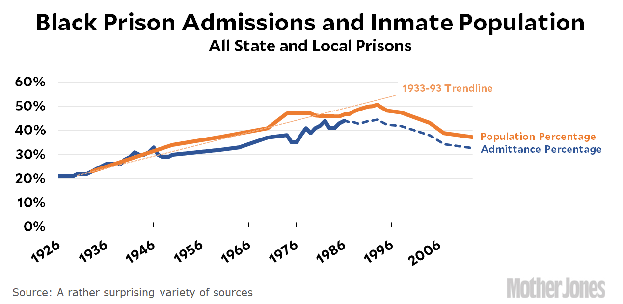
    This data is surprisingly hard to come by, and I had to cobble it together from a wide variety of sources. Luckily, in 1991 the Bureau of Justice Statistics published a short study called “Race of Prisoners Admitted to State and Federal Institutions, 1926-86.” I say “luckily” because this is not a statistic that can simply be pulled from a database somewhere. A researcher has to dig into the data, clean it up, and finally come up with a reliable and consistent table of data that covers a long time period. I also say “luckily” because this appears to be the only study ever done on this exact subject and it forms the backbone of my chart.

    That’s the dark blue line. The orange line is simple prison population by race, and this is a little easier. Early data comes from census reports and later data from annual Justice Department bulletins. As you can see, it follows the blue line pretty closely and provides a good check that the 1991 study is fairly reliable.

    So what does this show us? Surprisingly (to me, anyway), what it shows is that there wasn’t a huge surge in the rate of black imprisonment during the drug wars of the 70s and 80s. Rather, the share of black men being arrested and imprisoned has gone up slowly but steadily since at least 1926. Between 1970 and 1990, the total number of people in prison skyrockets, but the share of prison admissions that’s black continues the same slow ascent it’s displayed all along.

    I’m not sure what to make of this. Alexander’s argument about the war on drugs might still be correct. Contrary to what most people think, our nation’s prisons aren’t mostly filled up with drug offenders. It’s mostly filled up with robbers and murderers and carjackers and other folks who have committed violent crimes. So even if the drug offenders who are arrested and imprisoned are very heavily black, it might not affect the overall black imprisonment rate a lot.

    I’m not sure, and I’m not going to draw any conclusions here. Maybe I’m missing something in the data. Or maybe it doesn’t matter. Maybe the black share of prisoners didn’t change much during the prison-building boom of the 70s and 80s, but the simple act of imprisoning more people was all we needed to make sure we got lots of black men off the streets and under the control of the criminal justice system. If a few white men were collateral damage, so be it.

    Either way, though, it seems like the story changes. The war on drugs, in particular, doesn’t seem like it had a noticeable effect on black imprisonment rates, and Alexander tosses around numbers so blithely in her book that it’s impossible to construct a consistent statistical argument from them.

    The New Jim Crow was published in 2012, and it’s entirely likely that it’s been discussed to death since then. Maybe my objections here are nothing new and have been addressed before. But if they have, I haven’t noticed it. I’m curious if anyone has anything to say about this.

    POSTSCRIPT: It’s worth noting that the imprisonment rate of black men began to fall a couple of decades ago and has continued to fall ever since. It’s still far higher than the white imprisonment rate, but there’s at least some progress being made.

    I’d also like to point out, as usual, that even if you think the prison-building spree of the 70s and 80s was misguided, it wasn’t completely irrational. Violent crime really did start to skyrocket in the mid-60s, and it really did scare people—including black people in urban cores who were the most numerous victims. As we now know, the crime increase was largely caused by lead poisoning, but nobody knew it at the time. They just knew that their streets were unsafe and they wanted something done about it.
  • No Surprise: Health Insurance Saves Lives

    It’s really hard to evaluate the effect of health coverage on health. Sure, you can compare groups with and without coverage, but they’re almost certain to be so different (in income, race, employment, age, etc) that it’s impossible to tease out the effect of health coverage itself. Ideally, you’d like to perform a randomly controlled trial where you take a single group and then randomly split it in half. One half gets coverage and the other doesn’t. Since the two groups are the same, it’s fairly straightforward to measure health differences and then calculate how they’re related to coverage.

    Unfortunately, an RCT is all but impossible in this arena. How do you randomly deny health coverage to half a group, after all? It’s basically only been done once, when Oregon conducted a lottery to decide who would qualify for Medicaid coverage from a group of people on a waiting list. The Oregon study was interesting, but the sample size was smallish and the results have been hard to quantify.

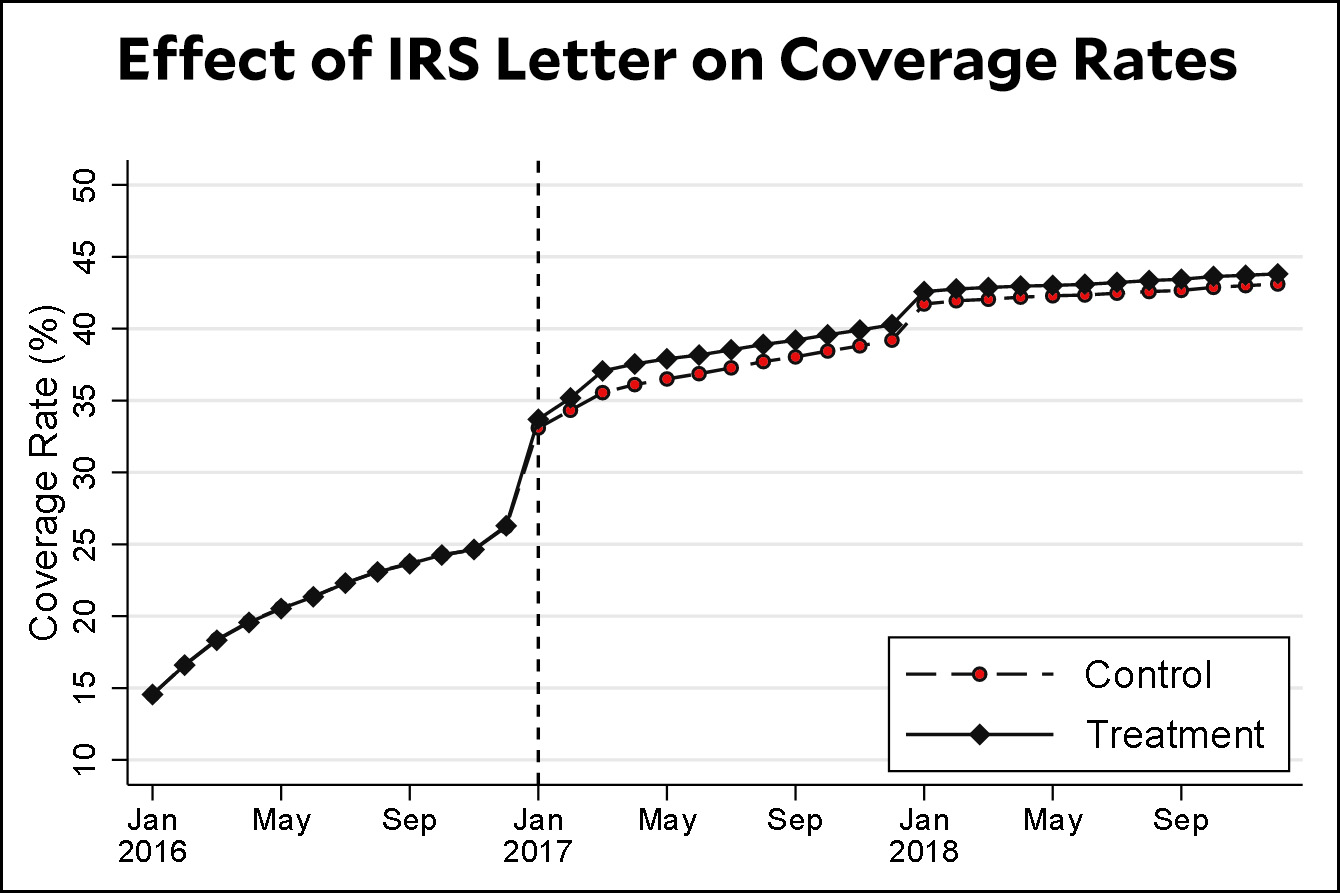
    But now a team of researchers has conducted a different kind of RCT. In 2015 the IRS sent out a letter to people who paid a penalty for not having health insurance and provided them with information about the cost and availability of getting coverage via either Medicaid or one of the Obamacare exchanges. Millions of letters were sent out, but 14 percent of the group was randomly selected to not receive the letter. Here’s how that affected coverage in the following year:

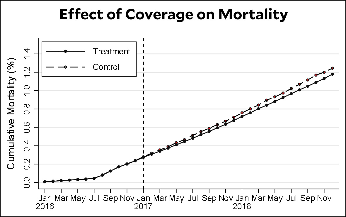
    The difference in takeup rates is about one percentage point. This may seem small, but when the test group is very large that’s plenty to deliver reliable results. Here’s what happened:

    The control group, which had lower rates of coverage, also had higher mortality rates. The difference is small, about 0.05 percentage points, which is not surprising since the death rate for middle-aged people is pretty small to begin with (in fact, the mortality part of the study was limited to individuals aged 45-64, since younger age groups have virtually zero mortality). But again, given the large size of the test group, it’s quite possible to draw conclusions from this difference:

    We found positive effects of the intervention on subsequent coverage enrollment decisions, particularly for taxpayers who were uninsured in the year prior to the intervention. We also found that the intervention reduced mortality among middle-aged adults in the subsequent two years, which we attribute to the additional coverage the intervention induced. Our findings thus provide strong empirical support, and the first experimental evidence, for the hypothesis that health insurance coverage reduces mortality.

    I’ve argued for a long time that focusing too much on mortality is misguided. Not only are mortality differences small among the non-elderly to begin with, which makes it hard to study even under the best circumstances, but mortality is a tiny part of what health care is about. By far, the greatest effect of health care for most of us is simply to make us feel better. We get antidepressants. We get flu shots. We get CPAP machines. We get artificial knees and hips. We get asthma inhalers. Most of these things have either no effect on mortality or only a tiny effect. Nonetheless, we’re collectively willing to pay a lot of money for this care, and we lead far better lives because of it.

    That said, it’s common sense that health coverage should also have some effect on mortality, and arguments to the contrary have always seemed a little silly to me. How could it not? That makes it nice to see experimental evidence confirming this.

    As always, this is just a single study and it might turn out that there are flaws in its design. Still, it’s the first to make use of a truly large test group, one that’s big enough to pick up tiny differences. And those differences, it turns out, are real.

  • On the Eve of Election, BoJo Hides In a Fridge

    Andrew Parsons/i-Images via ZUMA

    One of Piers Morgan’s producers tried to set up an impromptu interview with Boris Johnson this morning:

    When Swain presses the prime minister, stating he was live on the show, Johnson replied “I’ll be with you in a second” and walked off, before Piers exclaims “he’s gone into the fridge”. Johnson walks inside a fridge stacked with milk bottles with his aides. One person can be heard saying: “It’s a bunker.”

    Conservative sources subsequently insisted that Johnson was “categorically not hiding” in the fridge, from which Johnson emerged carrying a crate of milk bottles

    You know you’re having a bad day when your minders have to deny that you were hiding in a fridge. The election is tomorrow.

  • Latest International Test Shows American Performance Is . . . About the Same as Always

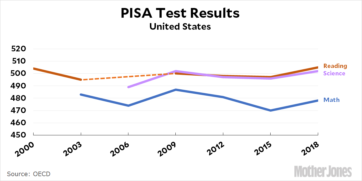
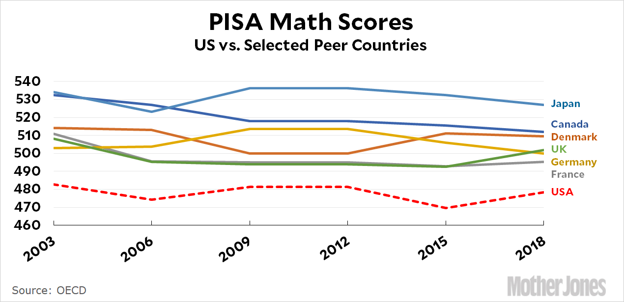
    The results of the latest PISA test are out, and since a picture is worth a thousand words, here’s a picture:

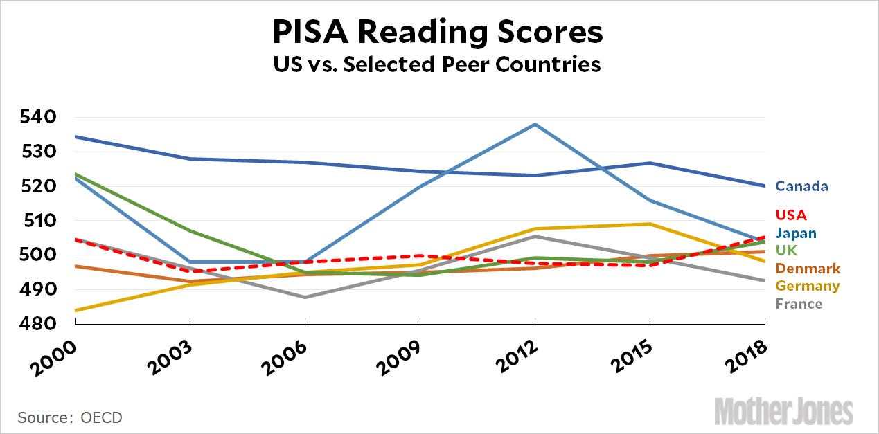
    The PISA test is administered by the OECD every three years to 15-year-olds, and roughly speaking American kids have been doing about the same on it for a couple of decades. However, what’s unique about PISA is that it’s an international test, which means we get to compare ourselves to other countries and then wail about how poorly we’re doing. Here are our scores on the reading test compared to a small subset of our peer countries:

    Not too bad! Canada is the outlier here, but we’re at the top end of the cluster of other countries. Now here’s math:

    Not so good! Japan is the unsurprising winner, and the US is bringing up the rear as it usually does. PISA’s approach to math is a little unusual, so every three years there’s a tedious discussion about whether this is the reason American kids don’t do very well even though they do fine on other math tests. Personally I don’t know. But we sure seem to fill up Silicon Valley and Wall Street with quants and coders every year.

    As always when I venture into OECD territory, I conclude that the whole test is a sham and the real test is whether or not you can figure out how to use the OECD’s data tools. I’ll give myself a B- this time around. However, you can also browse around the results on the Department of Education’s site, which includes comprehensive league tables that compare the US to the entire set of other countries that participate in PISA. Good luck!

  • Lunchtime Photo

    On Sunday evening Marian and I went down to the “Nights of 1000 Lights” at Sherman Gardens in Corona Del Mar. It was all quite lovely, of course, and among other things they had a Christmas tree where you could write down your Christmas wish on a red card and then tie it to a branch. Most of them looked like this:

    Uh huh. As usual, it took a child to show us the true spirit of this magical season:

    December 8, 2019 — Corona Del Mar, California
  • Why Do We Pretend That One-Parent Families Are No Big Deal?

    In the New York Times today, Christina Cross writes about “The Myth of the Two-Parent Home.” Her overall point is that single-parent homes aren’t the hellholes they’re made out to be, especially for black kids. But I’m confused. First there’s this:

    I tracked children’s household living arrangements from birth to adulthood, and I demonstrate that family structure has a weaker relationship to the educational success of black adolescents than of white adolescents. I show that living in a single-mother family does not decrease the chances of on-time high school completion as significantly for black youths as for white youths. Conversely, living in a two-parent family does not increase the chances of finishing high school as much for black students as for their white peers.

    OK, so living in a single-parent home is bad for kids, after all. But it’s not as bad for black kids as it is for white kids. But then there’s this:

    Researchers have hypothesized that disparities in access to socioeconomic resources […] might account for those differences. Because of historic and contemporary structural racism, black youths are more likely to be exposed to socioeconomically stressful environments than are white youths. Some scholars predict that the additional stress incurred by living apart from a parent is only marginally impactful, above and beyond the existing disadvantages.

    Hmmm. So the theory here is that black kids are exposed to so much stress already that a little more barely has an impact. Let’s keep going:

    Differences in access to socioeconomic resources such as mother’s education accounted for up to nearly 50 percent of the gap in high school completion….The importance of socioeconomic resources makes sense when we consider the racial gaps in income and wealth between black and white two-parent families. Although in general, youths raised in two-parent families are less likely to live in poverty, black youths raised by both biological parents are still three times more likely to live in poverty than are their white peers. Additionally, black two-parent families have half the wealth of white two-parent families. So, many of the expected economic benefits of marriage and the two-parent family are not equally available to black children.

    This really makes no sense. For starters, the usual progressive assumption is that those who are suffering the most deserve the most help. But in this case, Cross is suggesting the opposite: black kids are already suffering enough that we shouldn’t worry too much about tossing another log on the fire in the form of a one-parent home.

    Second, Cross suggests that socioeconomic resources account for much of the gap in high school completion. That’s plausible. But if we made some kind of massive effort to close that gap, it wouldn’t do us any good. It would just put black kids on a level footing with white kids, and their single-parent homes would then affect them as much as white kids.

    Why write an op-ed like this? Unfortunately, this is the kind of special pleading that’s common when the subject is family structure. On the one hand, there’s a pretty fair literature—which Cross’s own study supports—suggesting that a two-parent family is beneficial for kids (and less stressful for the parents). This is largely because two-parent families are richer; have more time to spend with their kids; are more stable; live in better neighborhoods; and, sometimes, provide better role models for their children. On the other hand, we liberals don’t like telling other people how to live their lives, and we especially don’t like to say anything that even remotely sounds like a criticism of black family lives. So we end up with op-ed pieces like this one that desperately try to make a case that really can’t be made.

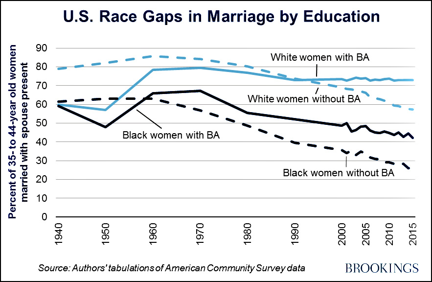
    It’s worth noting, though, that although we highly verbal, overeducated types might not like to say what we really think, we sure practice it. Marriage rates in the US have fallen overall, but mainly among women without college degrees. Those with college degrees continue to believe that marriage is important even if they aren’t willing to say so too loudly in public:

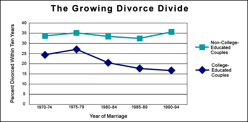
    The same is true of divorce:

    Divorce rates are up, but not among the college educated, where it’s not just low, but declining. It turns out that those of us with college degrees are pretty big believers in the value of getting married and staying married. We should be more willing to say so. It’s not like we’re going to force anyone to get married, after all. Still, since it’s obvious that we believe pretty strongly in marriage, why not work a little harder on extolling its benefits?

  • 25 Rooms to See Before You Die

    The New York Times Style Magazine has a big ol’ piece this week about the “The 25 Rooms That Influence the Way We Design.” It starts off badly with Stonehenge, which is not a room even by their panel’s loosey-goosey definition, and then moves on to the Pantheon in Rome—which is a building, not a room. But I guess maybe it’s a room too, and it does have walls and a ceiling.

    It gets better after that, and it’s sort of fascinating for someone like me who barely has an artistic bone in his body. The selections are heavily Britain/France/USA-centric with only eight rooms outside of the Big Three. Their favorite room, chosen by all six team members, is Pierre Chareau’s salon for Jean Dalsace’s Maison de Verre in Paris, built in 1932. Here’s the interior:

    François Halard

    Here is Nancy Hass’s nutshell description:

    The architect, Pierre Chareau, conceived the edifice as a series of interlocking forms, with the doctor’s office on the first floor and two private levels above….It has been compared in impact to Le Corbusier and Pierre Jeanneret’s Villa Savoye (1931) on the outskirts of the city. But unlike that imposing International Style monolith of reinforced concrete, the Maison de Verre possesses a lyrical delicacy owing to the work of the iron artisan Louis Dalbet, who created such touches as perforated mechanical screens to separate spaces and a rolling steel-pipe library ladder with wood inlays. After remaining in the Dalsace family for more than 70 years, the house was bought in 2005 by the history-obsessed American collector Robert M. Rubin, who meticulously restored it.

    I have personally seen almost none of these rooms except in pictures. I’ve seen the Pantheon. I’ve seen the last room in 2001: A Space Odyssey. And since room #4 is “The parlors of Georgian homes in the United Kingdom (circa 1714-1830; various architects)” I suppose I’ve seen several of those. But that’s it. Some of the rooms are open to the public and some aren’t, but perhaps the next time I take a trip to Paris or London I should try to see one of the public ones.

    All in all, a fun exercise.

  • Did Workers’ Wages Skyrocket During the ’70s? Not When You Figure In Inflation.

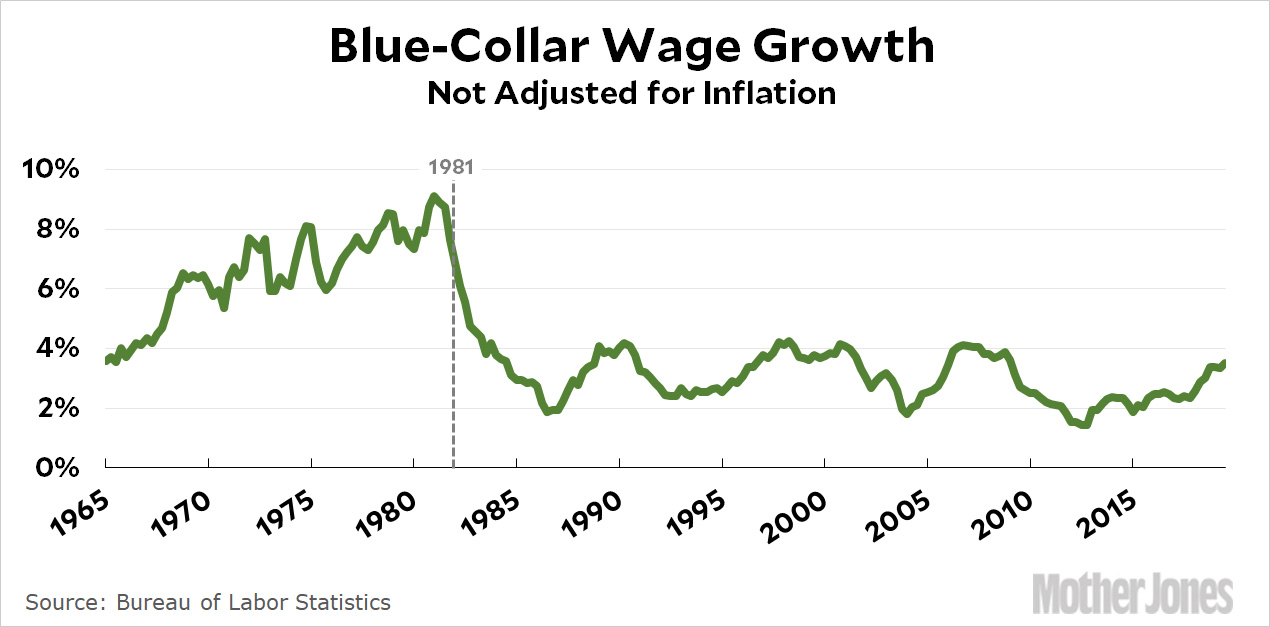
    Apropos of nothing in particular, you may be wondering why I was so annoyed by Heather Long’s piece on Friday that puzzled over why wage growth today is worse than wage growth during the late ’90s dotcom boom—but did its puzzling using nominal wage figures. Here’s an example that will help to explain. This chart shows hourly wage growth since 1965:

    The story here is that blue-collar wages rose steadily during the 70s, peaking at annual growth of 9 percent in 1980. During the start of the 1981-2 recession, wages grew about 7 percent, and even by the end of the recession wages were rising about 4 percent. After that, wage growth went up and down but always stayed within a healthy range of 2-4 percent. Add it all up, and blue-collar wages increased 226 percent through the end of the Bush administration. The total blue-collar wage increase through today amounts to 600 percent.

    Does this seem likely to you? If you lived through this era it sure doesn’t. You don’t remember huge wage gains in the ’70s or in the 1981-82 recession, which was the most brutal recession since the Great Depression. And if this is a story you tried to tell—big wage gains during the Nixon/Ford/Carter era, followed by big wage gains during the 1981-82 recession, and then settling down to about +3 percent wage gains for the rest of the decade—you  would be badly embarrassed for a good, long time.

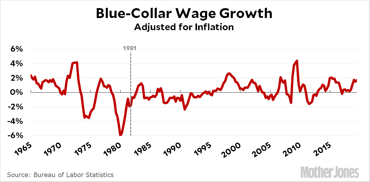
    Here, then, is the same chart but with inflation factored in:

    This looks quite a bit different. Wages went up and down in the 70s, but by the end of the decade hourly wages were a dollar lower than they had been at the beginning. In 1979 wages began to plummet, not getting back to positive growth until 1982. The rest of the decade is something of a train wreck for blue-collar workers, with wages mostly declining throughout the entire Reagan/Bush administration and not finally going positive until the middle of Bill Clinton’s administration. In reality, real hourly wages declined from $21.08 at the start of the Reagan era to $19.61 at the end of the Bush administration. That’s a loss of about $3,000 per year, or close to $6,000 per year in today’s money. If you add in the ’70s, it’s even worse: blue-collar wages dropped from $22.42 to $21.94. That’s a loss of $1,000 per year, or a little over $3,000 in today’s money. Put all this together, and blue-collar workers lost the equivalent of $9,000 in modern dollars, which represented a 13 percent decline in blue-collar wages over the course of a couple of decades. The entire period of the ’70s and ’80s was a catastrophe for blue-collar workers.

    This is how inflation works. Sure, wages grew 9 percent in 1980, but inflation grew 11%. A loaf of bread that cost a dollar at the beginning of the year cost $1.11 at the end. Sadly, your salary of $1 only went up to $1.09. Unless you can borrow a couple of pennies from someone, you can no longer even buy a loaf of bread. That’s how things really are.

    And that’s why you always show things like wage series corrected for inflation. That represents the real growth and decline of wages compared to the price of ordinary goods that are rising or declining because of inflation. The only exception to this rule applies to arcane studies where the nominal number of dollars might make a difference regardless of the inflation rate. But unless you’re an arcane economist, you’re not likely to ever run into this situation.

    Moral of the story: Always correct time series of money for inflation. There are no excuses.

  • Congress Unveils Articles of Impeachment

    Abaca/Abaca via ZUMA

    Well, there we have it: House Democrats have told us there will be two articles of impeachment against President Trump. The first is abuse of power related to his attempted extortion of Ukraine to provide him with a personal benefit. The second is obstruction of Congress, for his relentless strategy of refusing congressional subpoenas and preventing executive branch officers from testifying about Ukrainegate.

    These are pretty obviously slam dunk cases, but just as obviously they will fail in the Senate. And then what do we do with our country?