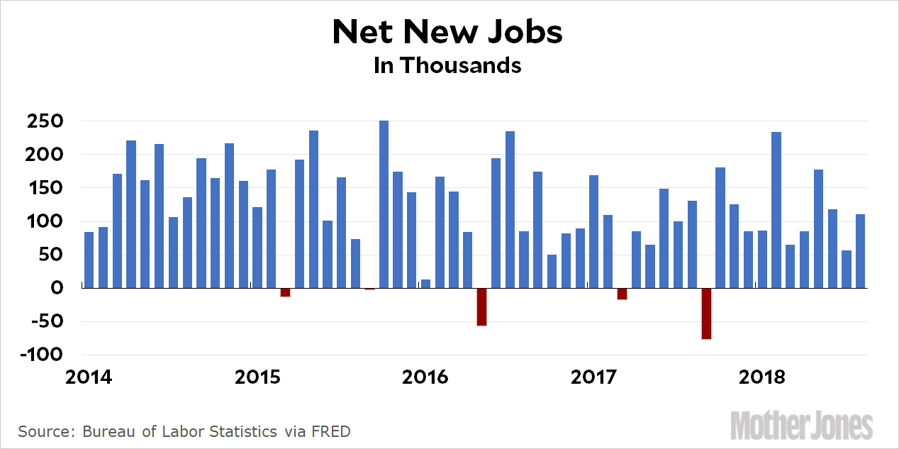
The American economy gained 201,000 jobs last month. We need 90,000 new jobs just to keep up with population growth, which means that net job growth clocked in at a fairly decent 111,000 jobs. The unemployment rate stayed flat at 3.9 percent. However, the number of people with jobs declined by 423,000; the number of unemployed workers barely changed; the labor force fell by nearly half a million; and the labor participation rate dropped from 62.9 percent to 62.7 percent. Overall, this is a pretty mediocre jobs report.
Wages of production and nonsupervisory workers were up at an annualized rate of 3.9 percent. Not bad! Inflation is running at 2.9 percent right now, so this represents a real pay raise of about 1 percent.
It’s hard to know what to think of this report. The jobs increase isn’t bad, but the rest of it ranged from mediocre to lousy. Blue-collar wages were up, but we’ve seen good months before followed immediately by bad ones. Even with August’s nice wage number, wage growth for the previous 12 months is 2.8 percent, slightly below the inflation rate. We’ll need many more months of high growth before we put together a solid year.
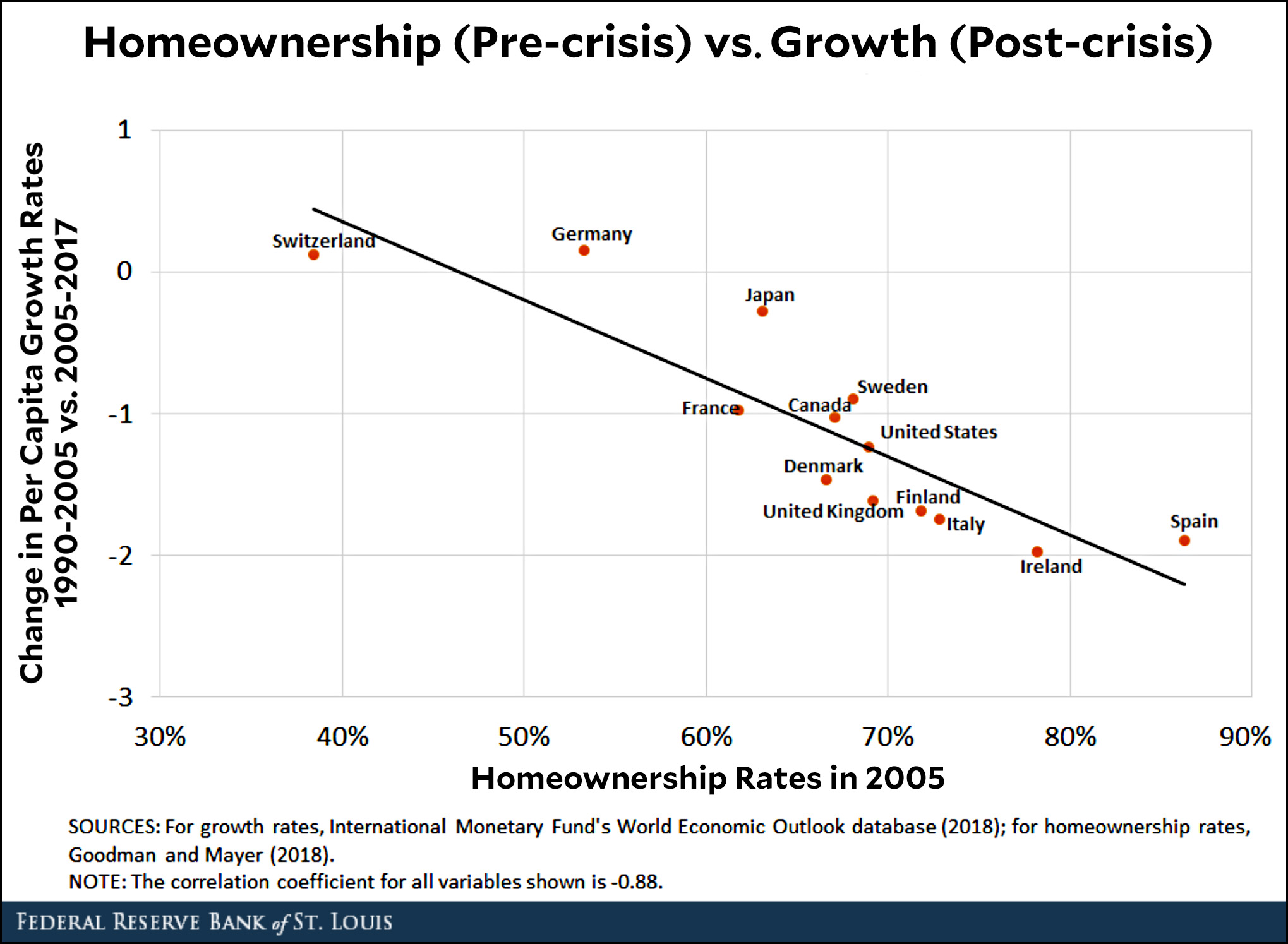
Here’s an interesting chart from the St. Louis Fed. It shows exactly what you’d expect, but it’s still nice to see it demonstrated so clearly:
What this chart shows is simple:
Countries with high homeownership rates (on the right) had the biggest housing bubbles and the biggest crashes.
The effects of those crashes persisted for over a decade.
Today, the countries with the biggest crashes (on the bottom) are still feeling the worst effects on growth rates.
Switzerland and Germany, with low homeownership rates, are growing today at about the same rate as they were before the financial crisis. The US, with a fairly high homeownership rate, is growing about one percentage slower. Ireland and Spain, with huge homeownership rates, were hit the hardest and are still feeling the greatest pain. Their growth rates are two points lower than they were pre-crisis.
But there’s another point to make about this chart: although it’s unlikely that the relationship between housing and growth could have been eliminated completely, the fact that it’s so strong is powerful confirmation that the political response to the crash was far too weak—and it was far too weak everywhere. If the US, to pick an example, had responded with stronger and longer fiscal/monetary/regulatory policies, it could have made up the lost demand from the housing crash far more quickly and gotten back to its old growth rate in a year or three, instead of ten.
Some countries, like Ireland and Spain, were handcuffed by the euro and weren’t strong enough or independent enough to respond properly on their own. In those cases, some of the blame resides in Germany and France, the big EU core countries.
The world’s large economies did respond to the crash. And it’s only fair to acknowledge that, to this day, you can point to no more than one or two countries that have responded to a banking crisis with the proper vigor even after the lesson of the Great Depression. Unfortunately, the prospect of truly massive stimulus seems to be scarier than the prospect of future economic sluggishness. Even now, with abundant evidence that strong stimulus had little to no impact on inflation, I expect that if the global economy crashed tomorrow we’d still be too timid to respond to it with the energy it requires. Our financial class has learned nothing and forgotten everything.
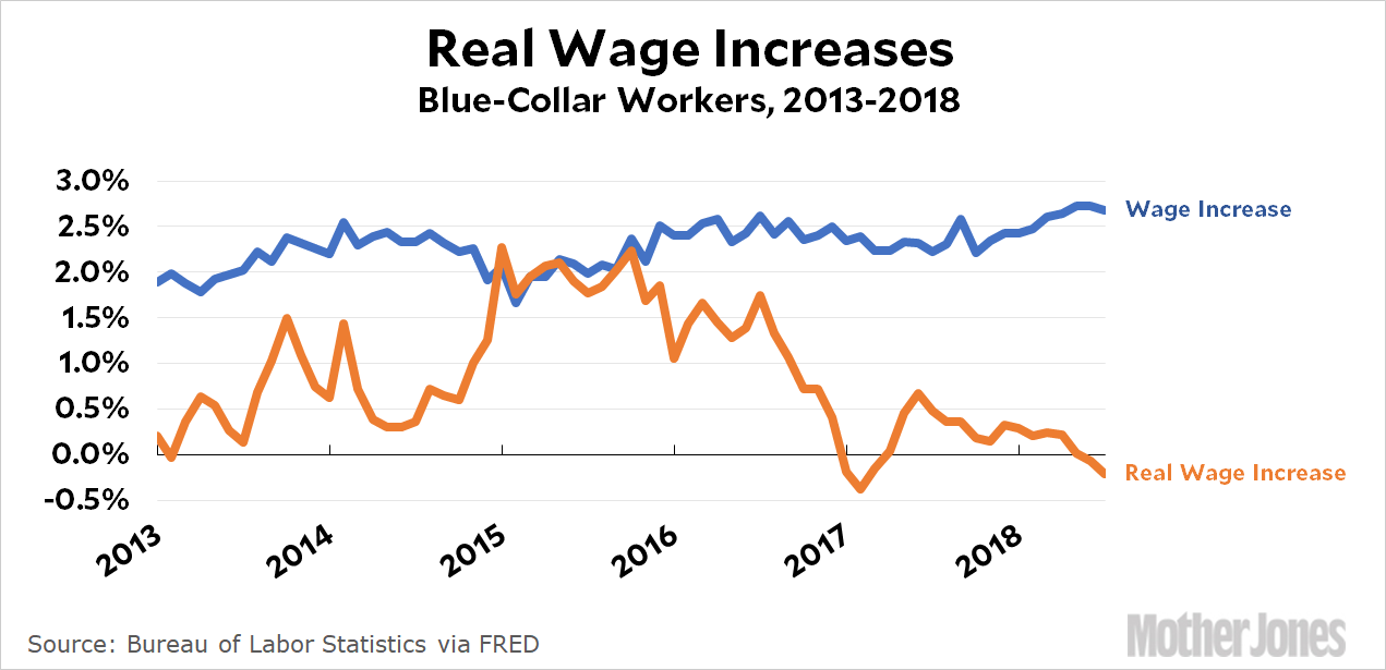
OK. It’s time for wage growth. Today the Council of Economic Advisors released a 30-page report trying to show that wage growth is higher than everyone thinks. To start with, here’s the kind of chart you normally see:
The blue line shows how much hourly wages have been increasing (about 2-2.5 percent per year) and the orange line shows hourly wages after you correct for inflation. When you do this, there’s been close to zero wage growth over the past couple of years.
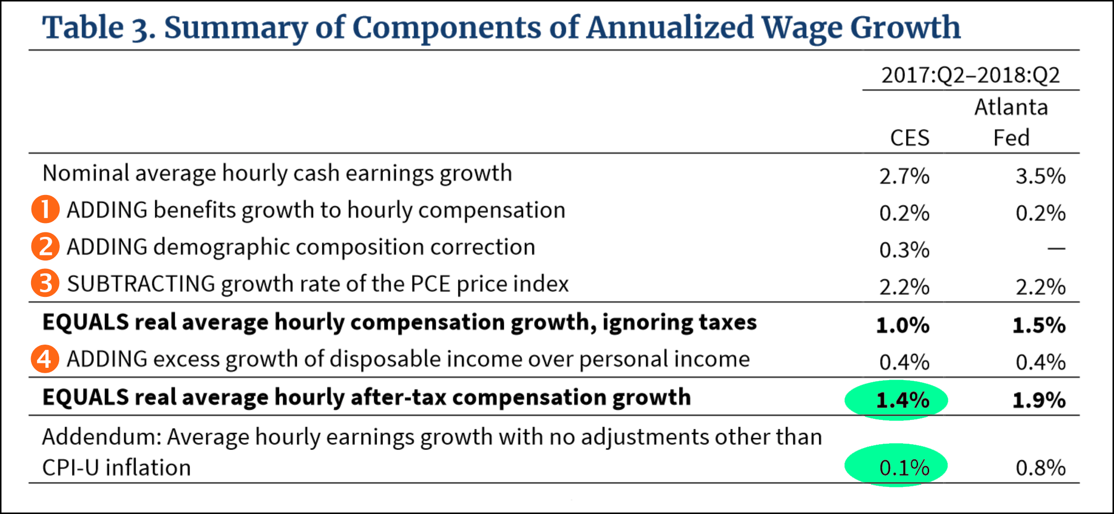
But the CEA says this isn’t right. After a longish primer on wage measures and a bunch of huffing and puffing, the report ends up telling us there are four things the normal measure gets wrong. When you correct them, real wage growth turns out to be 1.4 percent, not 0.1 percent:
Let’s go through these one by one:
Benefits. This is OK. The BLS reports that benefits increased 3 percent over the past year, which is faster than cash wage growth. I don’t know if 0.2 percent is precisely the right correction to use, but it’s probably in the ballpark.
Demographics. Ma-a-a-a-ybe. This is a very tricky statistic to use properly, and a very easy one to misuse. The basic idea is that the American population is aging, which means every year it has a bigger share of old (and relatively affluent) people and a smaller share of young (and relatively) poor people. This skews wages up slightly—but the key word here is slightly. For a very large group of people (i.e., all wage earners of all ages) I’m very skeptical that this could account for a correction of 0.3 percent in a single year. My bet is that it’s a lot closer to the Atlanta Fed’s 0 percent estimate, but as a compromise I’d go with 0.1 percent.
PCE inflation. No. PCE has become a popular measure among people who want to claim that inflation is lower than we think and therefore wage growth is higher than we think, but you shouldn’t buy it. I wrote at length this afternoon about why I think ordinary CPI headline inflation is a better measure to use than PCE if you’re measuring houshold spending and income. Click here if you want the whole story.
The tax cut. Sorry, no. Money from a tax cut just doesn’t count as part of wage growth. It’s perfectly fine to brag about how much money your tax cut is putting in people’s pockets, but you simply can’t pretend that this is related in any way to ordinary wage growth.
In the end, I’ll buy a total correction of 0.3 percent, which raises real hourly earnings growth from 0.1 percent to 0.4 percent. That’s still pretty dismal, though. And there’s one more thing: if you’re going to do this, you really need to apply the same correction to wage growth going back 30 or 40 years. That way we can compare wage growth this year to wage growth in the past. Without this, it’s just a standalone number calculated in a weird way that no one else uses. And that doesn’t mean much.
This is what Brett Kavanaugh has looked like most of the day.Alex Edelman/CNP via ZUMA
This has been a weirdly rushed day for me. I had the whole 5-hour infusion thing going, which slows me down to begin with, but then I decided to produce a whole bunch of charts about the auto industry for no particular reason, and that took a bunch of time. I finally finished, and then decided to write a long post about different measures of inflation. Why? I’ll explain in the next post. But it took forever, and I kept making mistakes, and by the time the infusion was done and I’d had lunch I still wasn’t done. So I plodded along after I got home and finally finished the damn thing around 3 pm.
In the meantime, I don’t really know what’s going on in the rest of the world. People are still blabbing about the anonymous op-ed, which I don’t really care about since it’s kind of a publicity stunt and doesn’t tell us anything we didn’t know before. And I really don’t care who wrote it.¹ Come on, folks.
So that leaves Brett Kavanaugh. Tell me if I have this right: Democrats are doing a pretty good job of going after him and leaving an impressive amount of chaos in their wake, and Kavanaugh is mostly responding like a deer in headlights. This is pretty interesting, but it also doesn’t matter. Unless Kavanaugh turns out to be the Zodiac Killer, Republicans are going to confirm him and that’s that—even if they have to keep half his career hidden from view in order to pull it off. Democrats can squawk and complain all they want, but in the end Kavanaugh will be a conservative Supreme Court justice who will probably serve for 30 or 40 years. Nothing else matters.
So now I’ll go ahead and write the post I was planning to write about wage growth over the past year. Believe me, you will be so fascinated you’ll barely be able to remove your eyeballs from your screen. It’s coming up soon.
¹Unless it turns out to have been written by someone really high up. That would be super interesting. Maybe Vladimir Putin can tell us?
What’s the best measure of inflation? The answer depends a lot on what you’re doing. Predicting future inflation? Figuring out how much we really spend on defense? Comparing physician salaries around the world? There are different measures of inflation that work best for all of them.
But let’s assume we just want “ordinary” inflation. That is, the average price rise experienced by the average family for a basket of average goods (food, gasoline, clothing, rent, etc.). The two main contenders are CPI—the Consumer Price Index—which you see on the news every month when they tell you how much “inflation” rose, and PCE—Personal Consumption Expenditures—which you never see. However, PCE is widely used in various professional contexts.
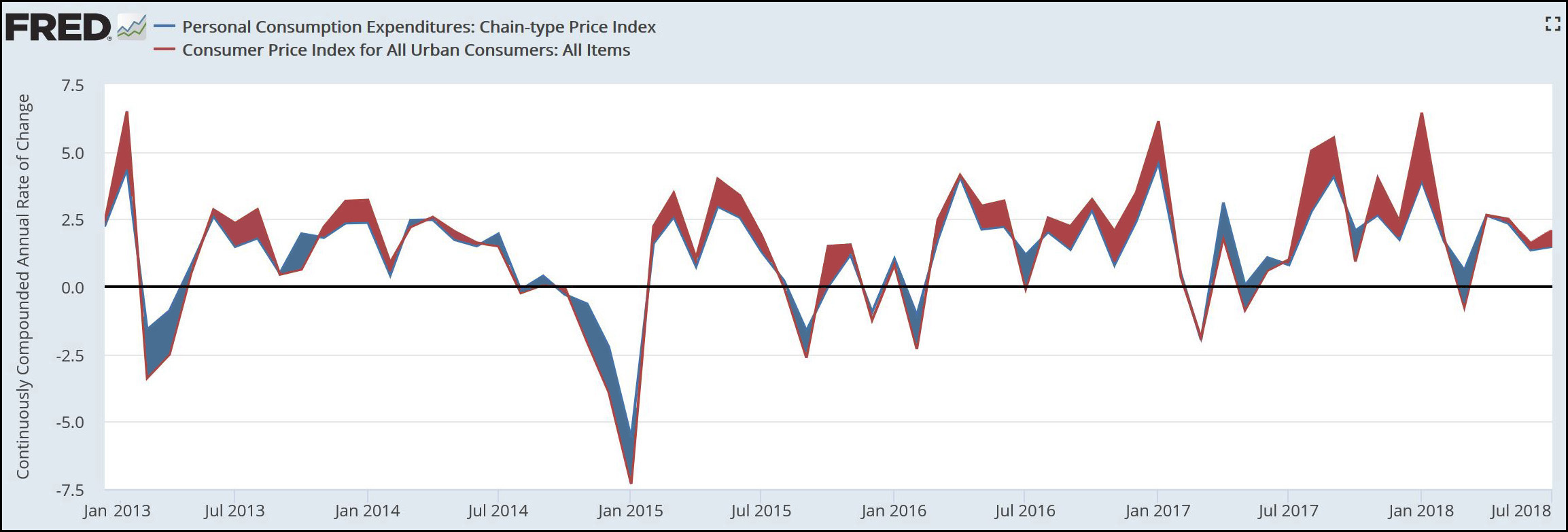
There is, generally, not much difference between the two. This chart from FRED covers the past five years and shows periods when CPI was higher (red) and periods when PCE was higher (blue). The differences mostly wash out, but over time PCE produces a slightly lower inflation rate than CPI.
Why does this matter? Consider an example. Suppose workers’ wages are up 2 percent but CPI is running at 2.5 percent. Prices are rising faster than wages, which means that in real terms workers are experiencing a 0.5 percent decline in purchasing power—in other words, a pay cut—not a 2 percent increase.
But suppose PCE shows inflation running at a lower rate of 1.5 percent. Now, wages are rising faster than prices, and in real term workers are seeing a 0.5 percent increase in purchasing power—in other words, a pay increase. It’s still not 2 percent, but at least 0.5 percent up is better than 0.5 percent down.
So which is it really? Speaking for myself, I prefer CPI. Its basket of goods is weighted based on household surveys, and it includes only medical expenses that households actually pay, not expenses paid by your employer or the federal government. These two things account for nearly all of the differences in the two indexes, and I think CPI is therefore more accurate if your goal is to measure the lived experience of average families.
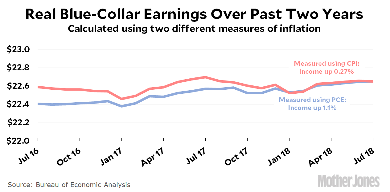
For example, here’s a chart showing what blue-collar wages looked like over the past two years:
Over the past two years, CPI measured the inflation rate at 4.7 percent. This ate away nearly the entire gain in wages, which means that real wage gains were close to zero.
But PCE measured the inflation rate at only 3.8 percent. According to the PCE index, prices didn’t go up as much, which means that wages really did gain some purchasing power. In this scenario, the real hourly wage increased from $21.58 to $22.65.
Blah blah blah. So which one is it really? Sorry. There’s just no firm answer to that. On a technical basis, there are experts who make a case for both. On a gut basis, there’s simply no way for any of us to “feel” a two-year difference of 1.1 percent vs. 0.27 percent. But one thing is clear: you need to decide which one you think is more accurate and stick with it. You can’t just pick whichever one happens to help your argument at the moment. For example, if you’re measuring something in the first half of 2017 and you really really want a high inflation rate to prove your point, you’d be tempted to choose PCE: it’s generally running higher than CPI during that period (look at the blue areas in the top chart). But in the second half of 2017, you’d be tempted to choose CPI since it’s generally running higher (red areas). Obviously you can’t do this. And you can’t do it between posts, using CPI one time and PCE another, unless you have a concrete reason for doing so and you explain it.
In the end, all I can do is repeat my preference: CPI has had some problems over the years, but they’ve nearly all been corrected and I think the current version is both admirably accurate and more household-oriented than PCE. Plus there’s the fact that government statistics almost universally use CPI. If you routinely use PCE, you’re routinely going to have to explain why your figures are a little bit different from the official BLS and BEA figures. Bottom line: when you net it all up, you’re really better off using CPI on a regular basis unless you’re a professional economist with a serious reason for using something else.
I’m stuck in the infusion center for the day, so blogging will probably be a little slow today. This has nothing to do with having an IV drip hanging off my arm, and everything to do with being forced to use my tablet’s on-screen keyboard instead of the awesome mechanical switch keyboard connected to my desktop machine.
(Just as I wrote those words, the pharmacy finally delivered the IV bags containing the meds. So I should get out of here around 1 pm, just in time for an East Coast late-day document dump.)
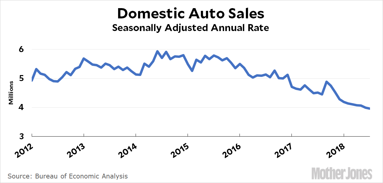
Anyway, I decided to kill some time by checking in on the auto industry to see how it’s doing. First up, here are domestic auto sales:
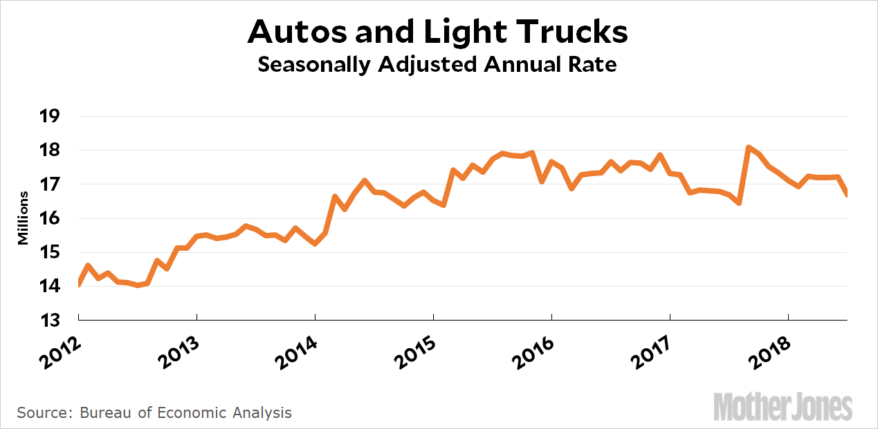
Down, down, down! Nobody want ordinary cars anymore, not if they’re produced in America, anyway. Now here’s a chart that shows everything: both car and light truck sales (including SUVs), domestic and imported:
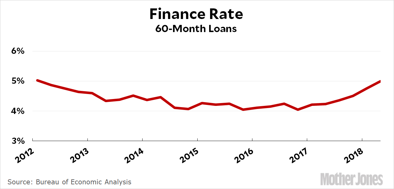
Sales reached a high of 18 million in 2016, but have drifted down to 17 million since then. The beginning of 2018 started out weakly, with sales of about 16.5 million vehicles. Part of this might be due to financing. Interest rates are drifting up:
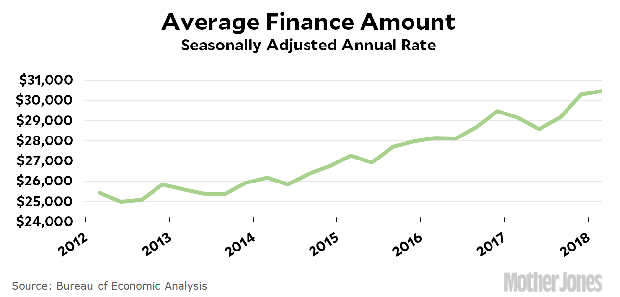
And the total amount being financed is growing:
A few years ago, people were financing $26,000 at 4%. Today it’s more like $30,000 at 5%. Roughly speaking, that’s a difference of $480 per month vs. $570 per month. That’s more than $1,000 per year. Given the sluggish wage growth of the past few years, this makes it hardly surprising that auto and truck sales are sluggish too. It hardly matters if “the economy” is doing well when your personal paycheck isn’t going up but the price of a car is. MAGA.
I spent Labor Day at a small party with some friends, and one of them mentioned that he’d given up on Android phones and switched back to Apple. In particular, he’d switched to the iPhone X and was totally in love with it. But it turned out it wasn’t really the phone he was in love with. “I really got it because I wanted the watch,” he told us. Christopher Mims says that my friend is part of a new wave that will power Apple’s future:
We are entering the third age of Apple. A PC company first, and now very much the trillion-dollar iPhone company, Apple Inc. is evidently in search of its next big thing….While the services that come paired with iPhones are themselves a substantial and growing part of Apple’s revenue, they will continue to need hardware to lock in customers. I’m placing my bet on a small but already thriving component of Apple’s portfolio: wearables.
In the company’s last earnings call, Apple Chief Executive Tim Cook said the company’s Apple Watch and AirPods headphones generated $10 billion in revenue across the past four quarters….The key is the portion of the company’s revenue that comes from services—a piece of the pie that’s been growing even faster than wearables sales. In 2017, “services” was already a $30 billion business at Apple, and in the company’s most recent quarter, it accounted for nearly $10 billion….All of Apple’s wearables are not only compatible with Apple’s services, but also seem designed to enhance those revenue streams. Consider the fact that a cellular-connected Apple Watch Series 3 can stream only Apple Music, or that Siri is the only smart assistant you can summon directly from Apple’s AirPods.
….Here’s how Apple maintains its edge and becomes the dominant wearables company: It makes the most capable and one of the most popular smartwatches in the world, but ensures that it’s not as useful without other Apple gadgets and services. Next, it repeats that logic for every class of wearable it eventually makes, be it headphones, glasses, health monitors or others. The result is a self-reinforcing halo effect, in which buying one Apple device pulls you into a whole world of Apple that is easier to remain in—and keep buying—than to ever leave.
In other words, it will be the usual contest between Apple’s closed ecosystem and Android’s open ecosystem. The Apple ecosystem will almost certainly work more smoothly and efficiently, and it will be expensive. The Android ecosystem will be vast and clunky as third parties scurry to get products on the market, but it will be cheap and it will grow fast. In other words, just like it is now except with way more toys. Welcome to your brave new world.
For the past couple of hours the chattering classes have been obsessed with an anonymous op-ed published in the New York Times this afternoon. And why not? It is a wee bit strange for an op-ed to be anonymous. In this case, it’s written by a “senior official” in the Trump administration¹ who wants us to understand that there are plenty of adults who are monitoring the president and making sure he doesn’t destroy the world. That’s good to know, isn’t it? At the same time, check this out:
The root of the problem is the president’s amorality. Anyone who works with him knows he is not moored to any discernible first principles that guide his decision making. Although he was elected as a Republican, the president shows little affinity for ideals long espoused by conservatives: free minds, free markets and free people. At best, he has invoked these ideals in scripted settings. At worst, he has attacked them outright. In addition to his mass-marketing of the notion that the press is the “enemy of the people,” President Trump’s impulses are generally anti-trade and anti-democratic.
It’s one thing to keep Trump from breaking up NATO on a whim or rerouting the Colorado River through San Diego so Mexico doesn’t get any of its water. But the fact that he’s not always as conservative as his aides would like him to be? Or that he’s anti-trade? Those are things that a president is allowed to be, whether we like it or not. When it comes to routine policy preferences, presidential aides are not supposed to be working against the president on the pretext that they’re saving the country.
On the other hand, if Trump is too stupid to figure out that this is happening, then I guess I don’t care. Let ’em brawl. Considering the astonishing level of amorality and cowardice that the Republican Party has shown in the era of Trump, I couldn’t care less what happens to them. With any luck, the entire party will disintegrate like the Whigs and be replaced by a new party with a modest veneer of principle and at least a pretense of regard for the non-white and non-rich. It can’t happen soon enough.
¹Not necessarily in the White House, though. Keep this in mind.
A few months ago I posted a picture of the Vincent Thomas Bridge at moonrise/sunset. The reflected sunlight made for an interesting shot, but I had a complaint: “Sadly, the bridge isn’t lighted, so it doesn’t make a good nighttime picture.”
As it turns out, I just wasn’t patient enough. The bridge is lighted, but not until it gets a little darker. So here’s a picture of the Vincent Thomas Bridge at night, nestled above the always bright and busy lights of the Port of Los Angeles.
POSTSCRIPT: For any locals wondering why the location of this picture is labeled Wilmington, it’s because the best view of the bridge is from the Knoll Hill Little League field, which happens to be just inside the city limits of Wilmington. My picture captions always tell you where I took the picture from and the date it was taken.
Can you pitch in a few bucks to help fund Mother Jones' investigative journalism? We're a nonprofit (so it's tax-deductible), and reader support makes up about two-thirds of our budget.
We noticed you have an ad blocker on. Can you pitch in a few bucks to help fund Mother Jones' investigative journalism?