James West/Mother Jones
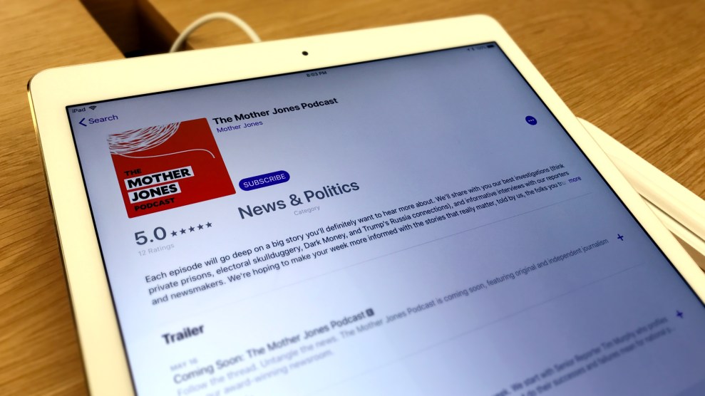
Yesterday, we launched the Mother Jones Podcast. One exciting step in putting out a new show is creating a logo that distills for eyeballs the essence of what we are offering listeners’ eardrums.
That’s where Adam Vieyra, our digital art director, stepped in. In this video, Adam explains how he conceptualized the logo from initial sketches to the final version: a ball of string with one thread sticking out, placed on our orange background. “It organically comes up as a terminology for reporting, to keep pulling on that string, or to keep gathering string on that,” Adam told me. “It’s just something I’ve heard in newsrooms, and specifically at Mother Jones.”
Watch Adam’s creative process unfold:
Really cool: MoJo digital art director @adamvieyra explains how he came up with our new logo for @MoJoPodcast—from initial sketches to the final thing. pic.twitter.com/g2fUcoXmN1
— James West (@jameswest2010) May 24, 2018
Listen to our debut show here:
And don’t forget you can subscribe using any of the following services:


