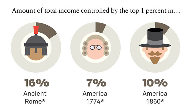
We’ll be posting a new chart on the current state of income inequality every day for the next couple of weeks. Yesterday’s chart looked at the history of the 1 percent, from ancient Rome to today.
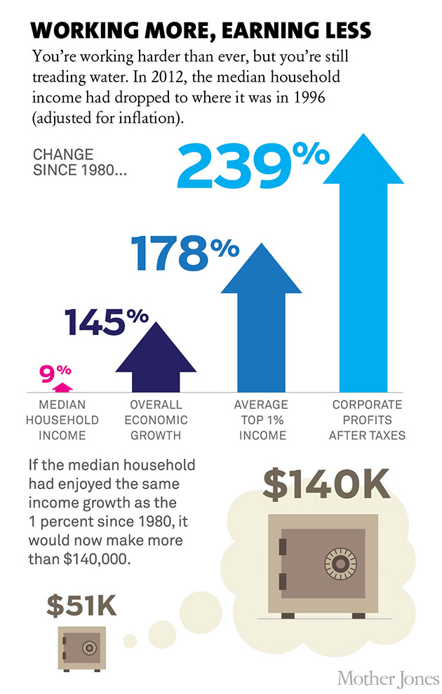
Today, another look at how middle-class incomes have been stuck in neutral while the rest of the economy has grown. In 2012, the median household income (adjusted for inflation) was the same as it was in 1996.
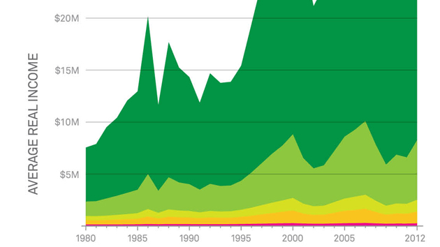
Sources: Household income: US Census; economic growth: St. Louis Fed; 1 percent: Emmanuel Saez and Thomas Piketty (Excel); corporate profits: St. Louis Fed
Illustrations and infographic design by Mattias Mackler?